Google Data Studio is now Looker Studio. It is Google's self-service reporting and dashboarding tool for turning data into interactive reports. Marketing teams use it to combine sources such as GA4, Google Ads, Search Console, BigQuery, Google Sheets and other connectors into dashboards that make campaign, SEO, ecommerce and lead generation performance easier to monitor.
Looker Studio is useful when a team needs repeatable reporting, not one-off screenshots. A good dashboard should answer business questions: what changed, why it changed, where the problem is and what should happen next. The tool can create attractive charts, but its real value depends on data quality, definitions, structure, validation and a clear decision-making process.
TL;DR
- Google Data Studio was rebranded as Looker Studio. Many marketers still search for the old name, but current Google documentation uses Looker Studio.
- Looker Studio is a reporting layer, not a data quality fix. If GA4, Google Ads or CRM data is wrong, the dashboard will show wrong data more neatly.
- The most common marketing sources are GA4, Google Ads, Search Console, BigQuery, Google Sheets and connector-based platforms.
- A dashboard should start with questions, not charts. Decide what the report must help the reader do before choosing visualizations.
- Blended data is powerful but risky. It needs shared keys, matching granularity and clear definitions.
- Looker Studio Pro is for organizations that need stronger content management, team collaboration, support and governance.
- The best dashboards include interpretation. Numbers should lead to decisions, not just decorate a monthly report.
What Looker Studio is
Looker Studio is a Google Cloud service for creating interactive reports and dashboards. It uses data sources connected through connectors, then lets users build tables, scorecards, charts, filters and controls in a drag-and-drop interface.
In a marketing context, Looker Studio is often used for:
- monthly performance reports;
- paid media dashboards;
- SEO dashboards;
- ecommerce dashboards;
- lead generation reporting;
- landing page monitoring;
- client reporting for agencies;
- campaign pacing;
- executive KPI summaries.
The product is especially popular because it connects easily with Google ecosystem tools. GA4, Google Ads, Search Console, BigQuery and Google Sheets are common starting points. External sources such as Meta Ads, TikTok Ads, LinkedIn Ads, Shopify, HubSpot, Salesforce or CRM exports usually require partner connectors, Google Sheets, BigQuery or another data pipeline.
Google Data Studio vs Looker Studio
Google Data Studio was the old name. Google announced in 2022 that Data Studio was joining the Google Cloud family and being rebranded as Looker Studio. In everyday marketing language, both names are still used.
For SEO and user clarity, it is useful to mention both:
- Google Data Studio: old name, still searched and used by many marketers;
- Looker Studio: current product name in Google documentation;
- Looker Studio Pro: paid version with enterprise-oriented capabilities;
- Looker: broader Google Cloud BI platform for governed business intelligence and semantic models.
Do not confuse Looker Studio with Looker. Looker Studio is usually the practical choice for self-service marketing dashboards. Looker is more relevant when an organization needs governed metrics, semantic modeling, embedded analytics and stronger enterprise data workflows.
What Looker Studio is good for
Looker Studio is best when the same data needs to be reviewed repeatedly.
Strong use cases:
- weekly PPC performance review;
- monthly client report;
- ecommerce revenue dashboard;
- SEO click and query monitoring;
- campaign budget pacing;
- landing page conversion monitoring;
- executive overview;
- CRM and marketing source comparison;
- GA4 event and funnel reporting;
- content performance dashboard.
Weak use cases:
- deep data modeling without a warehouse;
- complex multi-touch attribution by itself;
- messy data repair inside charts;
- replacing GA4 implementation work;
- replacing a CRM or BI warehouse;
- one-off strategic analysis where a spreadsheet is faster.
Looker Studio should simplify repeatable reporting. If every dashboard update requires manual fixes, the problem is usually the data pipeline or definitions, not the chart design.
Core concepts
Report
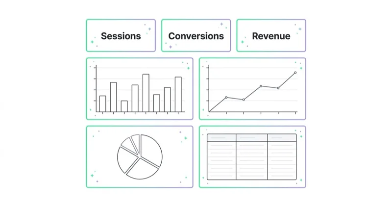
A report is the dashboard itself: pages, charts, tables, filters, controls and layout.
Data source
A data source connects Looker Studio to underlying data. Google describes a data source as a conduit between external data, such as a database or spreadsheet, and charts or controls in a report. The data source is also where fields can be modeled, for example by adjusting types or creating calculated fields.
Connector
A connector links Looker Studio to a product, platform or database. Google-provided connectors include Google Analytics, Google Ads, Search Console, BigQuery, Google Sheets and other Google products. Partner connectors extend this to non-Google platforms.
Dimension
A dimension describes data, such as date, campaign, source, medium, landing page, country or device.
Metric
A metric is a number, such as sessions, users, clicks, impressions, cost, conversions, revenue or conversion rate.
Calculated field
A calculated field is a field created with a formula, such as cost per lead, blended ROAS, branded vs non-branded classification or a cleaned campaign name.
Blend
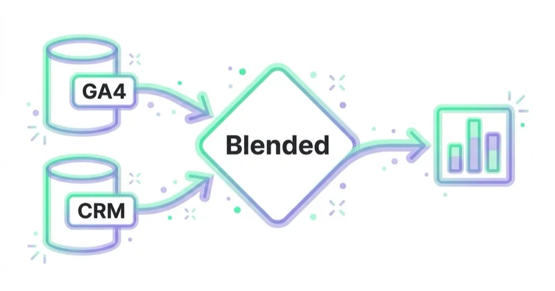
A blend combines fields from multiple data sources into one chart or table. This is useful, but it must be handled carefully because different sources often use different attribution rules, date logic and naming conventions.
Looker Studio vs GA4 reports
Looker Studio does not replace GA4. It visualizes data from GA4 and other sources.
| Area | GA4 | Looker Studio |
|---|---|---|
| Main role | Analytics data collection and reporting | Dashboard and visualization layer |
| Best for | User behavior, events, explorations, audiences | Repeatable reports and multi-source dashboards |
| Data sources | GA4 data | Many sources through connectors |
| Custom layout | Limited | Stronger |
| Client reporting | Possible but less flexible | Strong fit |
| Data quality | Must be fixed in implementation | Cannot fix bad implementation alone |
If GA4 events are missing, duplicated or badly named, Looker Studio will inherit that problem. Build the analytics foundation first.
For GA4 context, read Google Analytics 4: Why Implement It and What Are the Benefits? and What Is a Google Analytics Audit and Is It Worth Doing?.
How to build a useful Looker Studio dashboard
1. Define the audience
A dashboard for a CEO, PPC specialist, SEO consultant and sales manager should not look the same.
Questions:
- Who reads the report?
- How often is it used?
- What decisions should it support?
- Does the reader need summary or detail?
- Does the reader understand channel metrics?
- Is this an internal dashboard or client-facing report?
Executive dashboards should be short and decision-oriented. Specialist dashboards can include deeper tables, filters and diagnostics.
2. Define business questions
Start with questions before charts.
Examples:
- Is marketing generating revenue or qualified leads at the target cost?
- Which channel changed most compared with the previous period?
- Did performance change because of spend, traffic quality, conversion rate or average order value?
- Which landing pages convert best?
- Which campaigns are spending without qualified outcomes?
- Which SEO pages are gaining or losing clicks?
- Are GA4, Google Ads and CRM numbers directionally consistent?
If the dashboard does not answer a question, the chart probably does not belong on the first page.
3. Choose KPI definitions
Many dashboard problems are definition problems.
Define:
- conversion;
- key event;
- qualified lead;
- revenue;
- cost;
- ROAS;
- CPA;
- new customer;
- returning customer;
- source and medium;
- campaign naming;
- date range logic;
- attribution source.
Without definitions, teams argue about numbers instead of decisions.
For campaign tagging, read What Are UTM Parameters and How to Create UTM URLs for Google Analytics?.
4. Select data sources
A typical marketing dashboard may use:
- GA4 for behavior and conversions;
- Google Ads for cost, clicks and campaign data;
- Search Console for organic search queries and pages;
- Google Sheets for manual targets, notes or CRM exports;
- BigQuery for cleaned, joined or historical data;
- CRM data for lead quality and pipeline;
- ecommerce backend for orders, refunds and margin;
- partner connectors for non-Google ad platforms.
Do not connect every possible source at the start. Begin with the sources needed to answer the main business questions.
5. Design the dashboard structure
A clear structure is usually:
- Executive overview.
- Channel performance.
- Campaign performance.
- Landing pages.
- Funnel or conversion path.
- SEO or content section.
- Data quality notes.
- Recommendations.
The first page should show the state of the business, not every metric available.
6. Build the overview page
The overview page should answer: are things better, worse or stable?
Useful scorecards:
- revenue;
- cost;
- ROAS;
- conversions;
- CPA;
- conversion rate;
- average order value;
- qualified leads;
- pipeline value;
- organic clicks;
- paid spend;
- new customers.
Use comparisons carefully. Period-over-period and year-over-year comparisons can both be useful, but they answer different questions.
7. Add filters and controls
Filters should help users answer questions, not create confusion.
Useful controls:
- date range;
- channel;
- source / medium;
- campaign;
- device;
- country;
- landing page;
- product category;
- lead status.
Avoid adding too many controls for executive users. Too much flexibility can make a report harder to interpret.
8. Validate numbers against source platforms
Before sharing a dashboard, compare Looker Studio numbers with source tools.
Check:
- GA4 sessions and key events;
- Google Ads cost and conversions;
- Search Console clicks and impressions;
- CRM lead counts;
- ecommerce order revenue;
- date ranges;
- timezone;
- filters;
- attribution scope;
- currency;
- duplicated rows.
Small differences may be explainable. Large differences must be investigated before the report becomes trusted.
9. Add interpretation
A report should not only show numbers. It should explain what matters.
Add:
- summary notes;
- anomalies;
- decisions needed;
- next actions;
- data caveats;
- implementation notes;
- campaign changes during the period.
This is especially important for agency reports. A client should not need to decode a wall of charts to understand what happened.
Blended data: when to use it
Blending data can be useful when a single chart needs fields from multiple sources.
Examples:
- Google Ads cost with GA4 conversions;
- Search Console clicks with content update dates from Sheets;
- campaign targets from Sheets with Google Ads spend;
- CRM qualified leads with GA4 landing pages;
- ecommerce revenue with advertising cost.
Blending works best when data shares a clean key:
- date;
- campaign ID;
- landing page URL;
- source / medium;
- product ID;
- lead ID;
- content ID.
Be careful with blended metrics such as blended ROAS or blended CPA. GA4, Google Ads and CRM may use different attribution and conversion timing. If those differences are not explained, the dashboard can create false precision.
For complex joins, transformations, historical storage or governance, BigQuery is often a better place to prepare data before Looker Studio visualizes it.
Dashboard examples by business type
B2B lead generation
A B2B dashboard should connect marketing activity with lead quality, not just form volume.
Useful pages:
- overview;
- paid search and paid social;
- landing pages;
- forms and conversion rate;
- CRM lead status;
- cost per qualified lead;
- pipeline and revenue;
- sales feedback notes.
The dashboard should distinguish raw leads from qualified leads. Otherwise, campaigns with cheap but poor-quality leads may look successful.
Ecommerce
An ecommerce dashboard should connect revenue, cost, products and margin where possible.
Useful pages:
- revenue and orders;
- ROAS and CPA;
- channel performance;
- product category performance;
- cart and checkout funnel;
- top landing pages;
- refunds and returns if available;
- Merchant Center or feed health where relevant;
- new vs returning customers.
For store-level diagnosis, read How to Audit an Ecommerce Store and What Is Google Merchant Center and How to Manage It?.
SEO and content
SEO dashboards should avoid vanity-only metrics. Impressions are useful, but clicks, query relevance, landing page value and conversions matter more.
Useful pages:
- organic clicks and impressions;
- top queries;
- top landing pages;
- CTR changes;
- content updates;
- non-brand vs brand queries where possible;
- conversions from organic landing pages;
- pages losing clicks;
- pages needing refresh.
Google Ads reporting
Google Ads dashboards should include both efficiency and quality.
Useful pages:
- spend, conversions, conversion value;
- CPA and ROAS;
- campaign type;
- search terms;
- landing pages;
- device;
- impression share;
- budget pacing;
- conversion quality;
- key changes made during the period.
For audit thinking, read What Is a Google Ads Audit and How to Do It?.
Looker Studio Pro: when it matters
Looker Studio Pro is more relevant for organizations that need stronger control over content, collaboration and support.
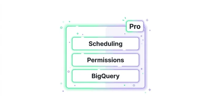
Consider Pro when:
- many teams create reports;
- dashboards must be centrally managed;
- enterprise support matters;
- ownership and permissions need governance;
- report sprawl is becoming a problem;
- shared workspaces and admin controls are needed.
Many small teams, agencies and freelancers can start with the no-cost version. The need for Pro usually appears when reporting becomes an organizational asset rather than an individual analyst's file.
Data governance and security
Dashboards often expose sensitive business data. Treat them like production assets.
Check:
- who owns each report;
- who owns each data source;
- whether viewer credentials or owner credentials are used;
- whether external users have access;
- whether public links are disabled unless intentional;
- whether CRM or revenue data is restricted;
- whether copied reports preserve sensitive connections;
- whether old client dashboards are still shared;
- whether data source credentials are documented.
Review sharing settings regularly. A beautiful dashboard is not useful if it leaks customer, revenue or campaign data to the wrong audience.
30-day Looker Studio implementation plan
Days 1-3: define questions and users
List dashboard audiences, business questions, primary KPIs and decisions the report should support.
Days 4-6: audit data sources
Check GA4, Google Ads, Search Console, CRM, ecommerce platform, Sheets and connector requirements. Validate that each source has the required fields.
Days 7-10: define metrics
Document conversion, revenue, cost, ROAS, CPA, qualified lead, campaign naming, date logic and attribution caveats.
Days 11-15: build the first version
Create overview, channel, campaign and landing page sections. Keep the first version simple.
Days 16-18: validate numbers
Compare dashboard data with source tools. Fix filters, connectors, date ranges and field definitions.
Days 19-22: add segmentation
Add controls for date, channel, device, campaign, country or landing page only where useful.
Days 23-25: add interpretation
Add notes, action boxes, recommendations and data caveats.
Days 26-30: share and operationalize
Set access, ownership, review rhythm and update process. Decide who reviews the dashboard and what decisions happen after review.
Common mistakes
| Mistake | Why it hurts | Better approach |
|---|---|---|
| Starting with charts | Dashboard lacks purpose | Start with questions and decisions |
| Too many metrics on one page | Users cannot see what matters | Use hierarchy and sections |
| No metric definitions | Teams debate numbers | Add a KPI glossary |
| Blind blending | False metrics | Validate keys and granularity |
| No data validation | Trust collapses | Compare with source platforms |
| No owner | Report decays over time | Assign maintenance responsibility |
| Public sharing by accident | Data exposure risk | Review permissions regularly |
| No interpretation | Users see data but no action | Add comments and next steps |
How we approach this at Space Ads
At Space Ads, we design Looker Studio reports from decisions backwards. We first define the audience, KPI definitions, source systems, attribution caveats and the questions the dashboard must answer; only then do we choose charts. For ecommerce, we separate revenue, margin, product, checkout and retention views. For lead generation, we connect media data with qualified lead and CRM outcomes so cheap form volume does not look like success. Before any report becomes part of a review rhythm, we validate it against GA4, ad platforms, CRM or backend data and document caveats. The goal is a dashboard that reduces debate about numbers and increases speed of action.
FAQ
Is Google Data Studio the same as Looker Studio?
Yes in everyday marketing usage. Google Data Studio was rebranded as Looker Studio. Many users still search for the old name, so both terms are useful in educational content.
Is Looker Studio free?
Looker Studio is available as a no-cost self-service reporting tool. Looker Studio Pro is the paid version with additional enterprise-oriented capabilities.
Does Looker Studio replace GA4?
No. GA4 collects and reports analytics data. Looker Studio visualizes data from GA4 and other sources. If GA4 tracking is wrong, Looker Studio will not fix it by itself.
What data sources can be connected?
Google connectors include sources such as Google Analytics, Google Ads, Search Console, BigQuery and Google Sheets. Other tools can be connected through partner connectors, files, Sheets, BigQuery or custom pipelines.
What is blended data in Looker Studio?
Blended data combines fields from multiple data sources in one chart or table. It is useful when sources share a reliable key, such as date, campaign, URL or product ID.
Why do numbers differ between GA4 and Looker Studio?
Differences can come from date ranges, filters, time zones, sampling or thresholding, attribution logic, data freshness, connector settings, duplicated events or incorrect metric definitions.
Should every dashboard include recommendations?
For business reporting, yes. A dashboard that only shows metrics can still be useful, but recommendations make it easier to turn data into decisions.
When should BigQuery be used with Looker Studio?
BigQuery becomes useful when data needs cleaning, joining, historical storage, governance, larger-scale processing or more reliable modeling before visualization.
Conclusion
Looker Studio is valuable when it turns recurring reporting into a decision system. It can combine marketing, analytics, advertising and business data in one place, but the quality of the dashboard depends on the quality of the data model and the clarity of the questions.
The best reports are not the busiest reports. They are structured, validated, readable and tied to action. Start with the audience, define the metrics, connect only the necessary sources, validate the numbers and add interpretation. Then Looker Studio becomes more than a reporting tool: it becomes a shared operating view for marketing decisions.
Sources and further reading
- Google Cloud - Looker product family documentation
- Google Cloud - Data Studio is now Looker Studio
- Google Cloud - Looker Studio Pro introduction
- Google Cloud - Available Looker Studio connectors
- Google Cloud - About data sources in Looker Studio
- Google Cloud - Schedule automatic report delivery
Continue learning
- Google Analytics 4: Why Implement It and What Are the Benefits?
- What Is a Google Analytics Audit and Is It Worth Doing?
- What Are UTM Parameters and How to Create UTM URLs for Google Analytics?
- How to Audit an Ecommerce Store
- What Is Conversion Rate and How to Increase It?
- What Is a Google Ads Audit and How to Do It?
Continue reading

Google Analytics MCP Server: Connect AI to GA4 Safely
Google Analytics MCP is Google's official read-only server for connecting AI to GA4 through the Admin API and Data API. This guide explains when it speeds up ad-hoc analysis, how to verify model answers and why clean events, UTM discipline and consent-aware measurement still decide whether the output is usable.

What Is Bounce Rate and How to Optimize It?
Bounce rate in GA4 is the share of sessions that were not engaged, but the number only becomes useful when it is tied to page intent, traffic source, device, events and business outcomes. This guide explains the GA4 definition, why Universal Analytics comparisons fail and how to diagnose bounce on landing pages, ecommerce pages, blog posts and lead-generation journeys.
What Is Ecommerce Analytics and Why Is It So Important?
Ecommerce analytics should connect GA4 events, backend orders, ad costs, product margin, refunds, stock, retention and LTV so decisions are based on profit quality, not only revenue. This guide explains what to measure, how to QA data and how to turn ecommerce reports into budget, UX, feed and merchandising actions.