Pop-ups are messages, windows or panels that appear above a page to draw attention to a specific action: newsletter signup, discount, lead magnet, cart recovery, product alert, survey, legal notice or operational update. They can improve conversion, but only when they are relevant, easy to close, accessible and shown at the right moment.
The problem is not the format itself. The problem is interruption without value. A well-designed pop-up can help a user complete a task. A poorly timed pop-up can block the content, damage trust, slow the page and create search visibility risk on mobile.
In 2026, pop-ups should be planned as part of conversion rate optimisation, not as a quick overlay added by a plugin. Timing, trigger, placement, frequency, accessibility, performance and measurement all matter.
TL;DR
- A pop-up should help the user do something useful, not simply interrupt the session.
- The safest formats are inline blocks, small banners, slide-ins and contextual prompts.
- Full-screen interstitials on mobile are risky when they hide the main content after a user arrives from search.
- Google recommends using less intrusive dialogs and avoiding designs that obscure the entire page unless legally required.
- Pop-ups should be shown after engagement signals, not immediately on first page load.
- Every pop-up needs an obvious close button, keyboard support and sensible focus handling.
- Frequency capping is essential because repeated pop-ups quickly reduce trust.
- Pop-up scripts, images and injected elements should not hurt Core Web Vitals, especially CLS and INP.
- Ecommerce pop-ups work best when connected to a specific shopping context, such as back-in-stock, cart recovery or free shipping progress.
- Measure incremental impact, not only signups or clicks.
What is a pop-up?
A pop-up is a user interface element that appears over, beside or within a page to present a message or action. In marketing, the term is often used broadly for:
- modal windows;
- slide-ins;
- notification bars;
- exit-intent overlays;
- embedded forms;
- cookie or consent dialogs;
- app install prompts;
- survey prompts;
- chat prompts;
- product alerts.
Not all of these behave the same way. A small banner at the bottom of the page is very different from a full-screen interstitial that blocks the page until the user closes it. Strategy should start with the job the message needs to do, not with the desire to show an overlay.
Types of pop-ups and prompts
| Format | Best use | Main risk |
|---|---|---|
| Modal pop-up | Strong action, lead capture, important offer | Can block content and frustrate users |
| Slide-in | Newsletter, guide, contextual offer | Can cover important buttons on mobile |
| Notification bar | Delivery threshold, promo, service notice | Can cause layout shift if inserted badly |
| Exit-intent | Cart recovery, lead magnet, last-chance offer | Works mainly on desktop and can feel manipulative |
| Inline block | Newsletter, guide, related offer inside content | Lower urgency, but usually better UX |
| Full-screen interstitial | Legal gate, selected campaigns | High SEO and UX risk when used aggressively |
| Chat prompt | Sales or support assistance | Can obstruct content and slow the page |
The safest approach is usually progressive. Start with inline content or a small prompt. Use stronger formats only when there is a clear reason.
When pop-ups make sense
Pop-ups can work when the message is relevant to the user's current intent.
Good use cases include:
- newsletter signup after a user reads part of an article;
- guide download on a topic page;
- product back-in-stock alert;
- size availability alert;
- free shipping progress message;
- cart recovery on desktop exit intent;
- limited offer for returning visitors;
- account or service update;
- post-purchase survey;
- webinar registration prompt on related content;
- lead capture after a visitor views service details.
Weak use cases include:
- immediate discount pop-up before the product page is visible;
- generic newsletter prompt with no reason to subscribe;
- repeated overlay on every page;
- mobile full-screen prompt after search landing;
- hidden or tiny close button;
- two or more pop-ups competing at the same time;
- pop-up that asks for an email before value is visible.
The better the context, the less aggressive the format needs to be.
Pop-ups and SEO
Pop-ups can affect SEO when they prevent users and search engines from accessing the main content. Google Search Central recommends avoiding intrusive dialogs and interstitials that obscure the entire page unless they are legally required. Google also recommends using banners that take only a small part of the screen instead of full-page interstitials.
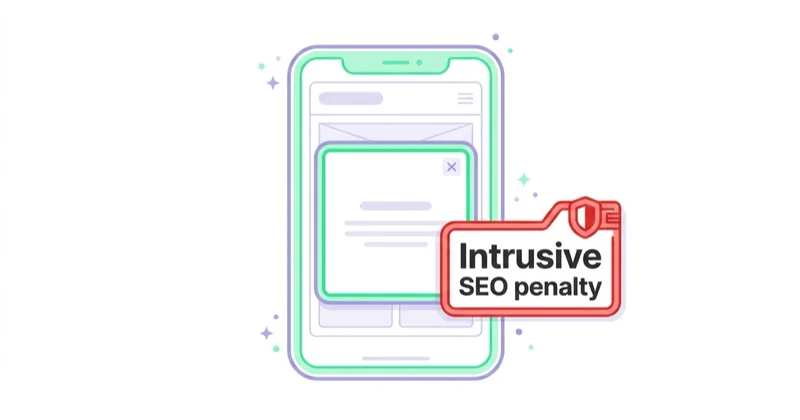
The risk is highest when a user lands from search on mobile and immediately sees a large overlay instead of the content they expected. That creates two problems at once: Google may have more difficulty understanding the page, and users may abandon the session because the experience is frustrating.
Not every pop-up is an SEO problem. Safer patterns include:
- small banners;
- slide-ins that do not cover the main content;
- inline forms;
- legal notices implemented as overlays without redirecting all users to a separate page;
- prompts triggered after user engagement;
- messages that are easy to close on mobile.
Riskier patterns include:
- full-screen interstitials immediately after landing from search;
- overlays that hide most of the content;
- prompts that must be dismissed before any content is visible;
- dialogs with no clear close action;
- redirects to a separate consent or signup page;
- multiple stacked dialogs.
For broader conversion strategy, see conversion rate optimisation.
Pop-ups and Core Web Vitals
Pop-ups can also affect page experience through Core Web Vitals.
The most common issue is CLS, or Cumulative Layout Shift. CLS measures unexpected visual movement. If a banner or pop-up is injected into the page and pushes existing content down, the layout can shift. This is especially common when marketing tools insert bars, forms, images or chat widgets after the page has already loaded.
To reduce CLS risk:
- overlay a prompt instead of pushing content when appropriate;
- reserve space in advance for banners that are part of the layout;
- avoid dynamically inserting large elements above existing content;
- set dimensions for images and embedded assets;
- test mobile and desktop separately;
- check field data, not only lab tests;
- avoid loading heavy third-party scripts early unless they are necessary.
Pop-ups can also hurt INP if the script blocks the main thread, delays interactions or loads too many third-party dependencies. A pop-up that improves email signups but makes the page feel slow may still reduce overall performance.
For retention channels that are less dependent on overlays, see push notifications.
Accessibility requirements
A pop-up that blocks the page must work for keyboard and screen reader users.
Important requirements include:
- visible close button;
- close button reachable by keyboard;
- Escape key support for dismissible dialogs;
- focus moved into the dialog when it opens;
- focus returned to the triggering element when it closes where practical;
- tab order kept inside the modal while it is open;
- clear heading or accessible label;
- readable contrast and text size;
- tappable controls large enough for mobile users;
- no hidden traps that prevent closing the dialog.
Accessibility is not separate from conversion. If a user cannot close, read or complete a pop-up, the experience fails commercially as well as technically.
Best timing and triggers
The worst default trigger is often immediate display on the first page load. At that point, the user has not seen the offer, product, content or brand yet.
Better triggers include:
- scroll depth;
- time on page;
- second or third page view;
- returning visitor status;
- product added to cart;
- product viewed more than once;
- exit intent on desktop;
- user reaching the end of an article;
- high-intent page visit;
- specific campaign source.
Timing should match the promise. A discount prompt can appear after product interest is visible. A guide download can appear after the user reads related content. A free shipping prompt can appear after there is something in the cart.
Frequency and suppression rules
Frequency capping is one of the easiest ways to improve pop-up quality.
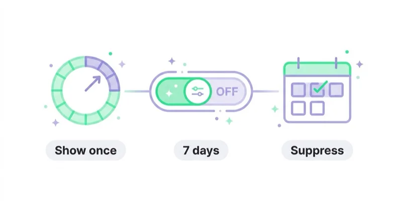
Useful rules:
- do not show the same pop-up more than once per session;
- suppress the pop-up after it has been closed;
- suppress signup prompts after signup;
- suppress discount prompts after purchase;
- exclude existing subscribers from newsletter pop-ups where possible;
- avoid showing multiple prompts on one page;
- set quiet periods after dismissal;
- adapt rules by device type.
A pop-up strategy without suppression rules often looks good in a tool dashboard and bad in real user sessions.
Copywriting for pop-ups
Pop-up copy should be short, specific and aligned with the user's current task.
Weak copy:
- Join our newsletter.
- Don't miss out.
- Sign up now.
- Get updates.
Stronger copy:
- Get the GA4 audit checklist before the next campaign launch.
- Get an alert when this size is back in stock.
- Save the cart and receive the product comparison by email.
- Book a 20-minute review before changing the campaign budget.
The message should answer three questions quickly:
- What is being offered?
- Why is it useful now?
- What happens after the click?
For offer and CTA quality, see how to write ad copy that converts.
How pop-ups work in ecommerce
Ecommerce is only one use case, but it is where pop-ups are used most aggressively.
Better ecommerce uses:
- first-order discount after browsing, not instantly on arrival;
- back-in-stock alert on unavailable products;
- size guide prompt on products with high return rates;
- free shipping progress bar in cart;
- abandoned cart prompt on desktop exit intent;
- bundle recommendation after add to cart;
- post-purchase subscription or replenishment reminder;
- loyalty signup after purchase.
Poor ecommerce uses:
- blocking product photos immediately;
- hiding price, delivery or return information;
- offering a discount before purchase intent is visible;
- showing a newsletter prompt during checkout;
- using several pop-ups at once;
- making the close button hard to tap.
For related ecommerce conversion ideas, see how to increase online sales, abandoned carts and product recommendations.
Pop-ups for B2B and services
For B2B, SaaS and services, pop-ups should usually be more restrained. The buying journey is longer, and trust matters more than quick discount capture.
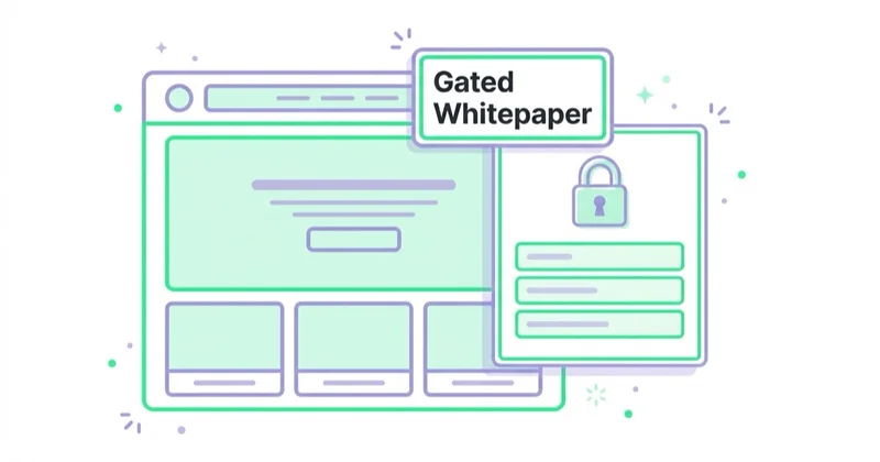
Good examples:
- webinar registration on a relevant topic page;
- benchmark report download after scroll depth;
- audit checklist on a service page;
- consultation prompt after viewing pricing or case studies;
- newsletter prompt at the end of an article;
- event invitation for visitors from a specific campaign.
Bad examples:
- generic "book a call" pop-up on every page;
- full-screen overlay before the offer is visible;
- aggressive countdown timers for complex services;
- asking for too much data too early.
For B2B, a lighter inline CTA often converts better than an interruptive pop-up because it respects the research process.
How to measure pop-up performance
Do not judge pop-ups only by form submissions. A pop-up can increase email captures while reducing purchases, lead quality or page engagement.
Track:
- impressions;
- close rate;
- conversion rate after display;
- conversion rate after interaction;
- incremental conversion versus a control group;
- revenue or lead quality from captured contacts;
- unsubscribe or spam complaint rate;
- checkout abandonment;
- scroll depth and engagement changes;
- Core Web Vitals impact;
- mobile versus desktop performance;
- repeat visitor behaviour.
The strongest test compares pop-up versus no pop-up for a defined audience. Without a holdout group, it is easy to overestimate impact because many people who converted after seeing a pop-up may have converted anyway.
How we approach this at Space Ads
A pop-up can genuinely lift sign-ups, yet it's just as quick to damage the experience and SEO, so we handle it with care. We don't fire it the second someone lands; we trigger on intent, on exit or after enough scrolling to show real interest. Frequency is capped so the same person isn't hit on every subpage. On mobile we almost never use a full-screen pop-up on entry: Google penalises intrusive interstitials that cover content, and they drag down Core Web Vitals too. Above all we judge the net effect, not the sign-up count. A pop-up that harvests emails while lifting bounce rate and putting buyers off is a loss, even when that one number looks great in a report.
Practical pop-up checklist
Before launching a pop-up, check:
- Is the message useful in this context?
- Is the trigger based on engagement or intent?
- Is the format as small as possible for the job?
- Is the pop-up easy to close on mobile?
- Does it work with keyboard navigation?
- Does it avoid blocking main content from search immediately?
- Does it avoid layout shift?
- Are frequency caps configured?
- Are existing customers, subscribers or converters suppressed?
- Is there a control group or A/B test?
- Is the impact measured beyond clicks and signups?
FAQ
Do pop-ups hurt SEO?
They can hurt SEO when they are intrusive, especially on mobile when they cover the main content immediately after a user arrives from search. Smaller banners, slide-ins and contextual prompts are generally safer.
What is the safest pop-up format?
Inline forms, notification bars and small slide-ins are usually safer than full-screen modals. The best format depends on device, page type and user intent.
When should a pop-up appear?
Usually after an engagement signal, such as scroll depth, time on page, viewing another page, adding a product to cart or desktop exit intent. Immediate first-load pop-ups should be used cautiously.
Are exit-intent pop-ups effective?
They can work on desktop for cart recovery, lead magnets and selected offers. They are less reliable on mobile because exit intent is harder to detect and the screen is smaller.
Should every ecommerce store use a discount pop-up?
No. Discount pop-ups can grow signups or short-term orders, but they can reduce margin, train visitors to wait for codes and attract low-quality contacts. They should be tested against non-discount offers.
How can a pop-up avoid CLS problems?
Avoid pushing existing content after load. Use overlays where appropriate, reserve space for fixed bars and test real mobile pages. Marketing widgets should be monitored like any other performance-sensitive script.
Conclusion
Pop-ups are useful only when they respect the user's task. The best pop-up strategy starts with relevance, timing and restraint. A small contextual prompt after engagement is usually better than a full-screen interruption before the page has delivered any value.
For SEO and user experience, avoid intrusive mobile interstitials, make every dialog easy to close, protect accessibility and monitor Core Web Vitals. For conversion, measure incremental business impact, not only the number of captured emails. A pop-up should improve the journey, not become a barrier inside it.
Sources and further reading
- Google Search Central: Interstitials and dialogs
- web.dev: Cumulative Layout Shift
- web.dev: Optimize Cumulative Layout Shift
- W3C WAI: Dialog modal pattern
Continue learning
Continue reading

Core Web Vitals: How to Fix LCP, INP and CLS
Core Web Vitals are assessed from real-user data at the 75th percentile, while lab tools help diagnose causes. Learn what LCP, INP and CLS measure and how to prioritise fixes by metric, template and user impact.
What Is Conversion Rate Optimization (CRO) and How Does It Increase Sales?
Conversion rate optimization improves the percentage of users who complete valuable actions. Learn how CRO works, how to measure conversion rate, what to optimize first and how it increases sales or lead quality.
How to Use Google Search Console for SEO
Learn how to use Google Search Console for SEO: Performance reports, CTR opportunities, indexing diagnostics, URL Inspection, Core Web Vitals and content planning.