A CTA, or call to action, is a prompt that tells a user what to do next. It can invite someone to buy, add to cart, book a consultation, request a quote, download a guide, start a trial, subscribe, continue checkout or contact a team.
An effective CTA is not only the text on a button. It is the combination of promise, context, visual priority, timing, page structure, perceived effort and trust. A button can say the right words and still fail if the user does not understand the offer or is not ready for the next step.
In conversion optimisation, CTA quality is one of the simplest things to inspect and one of the easiest things to oversimplify. The goal is not to make every button louder. The goal is to make the next step clear, relevant and worth taking.
TL;DR
- CTA means call to action: a prompt that directs the next user action.
- A good CTA is specific, visible and aligned with user intent.
- CTA copy should explain what happens after the click.
- The CTA should match the stage of the funnel: learning, comparing, deciding or returning.
- Benefit and effort must be balanced. A high-commitment action needs more trust.
- Button colour matters mainly through contrast and visual hierarchy, not because one colour is universally best.
- Accessibility matters: buttons and links need clear purpose, focus states and enough target size.
- CTA performance should be measured through meaningful events, conversions and downstream quality.
- The right CTA depends on commitment level: reading an article, downloading a file, sending a form and paying online are different asks.
- A/B tests should evaluate the whole decision context, not only one word or button colour.
- Ecommerce CTAs need supporting information such as delivery, returns, payment and availability.
What is a CTA?
A CTA is a call to action: a short instruction, label, button, link or prompt that guides a user toward a desired action.
Examples include:
- Add to cart;
- Book a consultation;
- Download the checklist;
- Request a quote;
- Start free trial;
- Compare plans;
- Continue to checkout;
- Join the webinar;
- Get the audit template;
- Contact the team.
The CTA can appear as a button, text link, form button, sticky bar, product card, ad headline, email link, pop-up prompt or in-app message.
The best CTA answers two questions quickly:
- What happens after this action?
- Why is this action worth taking now?
CTA vs button copy
Button copy is part of the CTA, but the CTA is broader.
A full CTA includes:
- user intent;
- page section;
- surrounding copy;
- proof or reassurance;
- button or link label;
- visual hierarchy;
- form or action after click;
- expected outcome;
- tracking and measurement.
For example, the button text "Get started" may be weak on its own. It becomes stronger when the section explains the value, shows what happens next and reduces risk. The button does not carry the whole persuasion job alone.
What makes a CTA effective?
1. Clarity
The user should know what will happen after clicking. "Click here" is usually weak because it describes the mechanics, not the outcome.
Better examples:
- View pricing;
- Download the CRO checklist;
- Book a 20-minute audit;
- Continue to payment;
- Get product availability alert;
- Compare packages.
Specific language reduces uncertainty. It also helps users scan the page faster.
2. Intent fit
The CTA should match the user's stage of decision-making.
At the top of the funnel, lighter actions often work better:
- Read the guide;
- Download the checklist;
- Watch the webinar;
- See examples;
- Compare options.
At the bottom of the funnel, stronger actions make sense:
- Buy now;
- Start checkout;
- Request a quote;
- Book a demo;
- Contact sales;
- Start trial.
For the bigger journey, see sales funnel strategy.
3. Clear value
The CTA should be connected to a reason. "Subscribe" is weaker than "Get the weekly PPC optimisation checklist" because the second version explains what the user receives.
Good CTA context explains:
- the benefit;
- the deliverable;
- the time needed;
- the level of commitment;
- the next step;
- the risk reduction.
If the action asks for personal data, money or time, the value needs to be clearer.
4. Low friction
Friction is the perceived effort or risk behind the click.
Common sources of friction:
- long forms;
- unclear pricing;
- hidden delivery cost;
- forced account creation;
- vague consultation process;
- no confirmation of what happens next;
- weak trust signals;
- slow page or form;
- unclear privacy terms.
The CTA should be realistic about the commitment. "Start free trial" is more demanding than "See product tour". "Book a strategy call" is more demanding than "Get the checklist".
5. Visual priority
A primary CTA should be easy to find, especially on mobile. It should not compete with five equally strong buttons.
Good visual priority comes from:
- contrast;
- spacing;
- clear button shape;
- consistent placement;
- enough tap area;
- limited competing actions;
- readable text;
- supporting microcopy.
The colour itself is not magic. A green button does not automatically convert better than a black, blue or red button. What matters is whether it is visible, accessible and visually aligned with the page.
6. Trust support
Some CTAs need reassurance nearby.
Examples:
- Free returns;
- No credit card required;
- Response within 1 business day;
- Secure payment;
- Cancel anytime;
- 30-day access;
- Includes checklist and template;
- Used by B2B ecommerce teams.
Microcopy near the CTA can reduce hesitation more effectively than changing the button text.
CTA examples: weak vs stronger
| Weak CTA | Stronger CTA | Why it is stronger |
|---|---|---|
| Click here | View the offer | Describes the destination |
| Submit | Send enquiry | Explains the action |
| Download | Download the GA4 checklist | Names the asset |
| Next | Continue to payment | Sets expectation |
| Buy | Add to cart | Lower commitment at product stage |
| Contact us | Book a 20-minute consultation | Explains the next step |
| Learn more | Compare campaign types | More specific intent |
Not every CTA needs to be long. It needs to be clear enough for the context.
CTA copy formulas
CTA copy becomes easier to write when it is based on a clear formula instead of a random verb. The formula should match the offer and the user's intent.
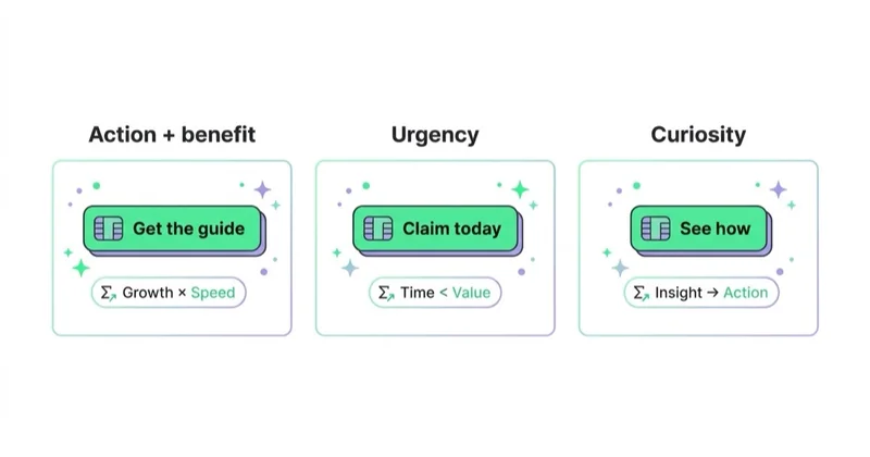
Useful CTA formulas:
- verb + destination: "View pricing", "See case studies", "Compare plans";
- verb + asset: "Download the GA4 checklist", "Get the template", "Watch the demo";
- verb + outcome: "Improve checkout tracking", "Reduce wasted spend", "Find conversion leaks";
- verb + time frame: "Book a 20-minute consultation", "Start a 7-day trial";
- verb + next step: "Continue to payment", "Send enquiry", "Choose delivery option";
- low-risk prompt: "See how it works", "Preview the report", "Check availability".
The strongest version is usually specific without becoming heavy. "Download the checklist" is clear. "Download the comprehensive performance marketing optimisation checklist for ecommerce teams" may be accurate, but it is too long for a button. Longer context can sit in the heading or microcopy near the CTA.
For B2B lead generation, it is often better to explain the next step than to overpromise the final result. "Book a media audit" is clearer than "Scale my business" because the user knows what action is being requested. For ecommerce, the CTA should usually stay transactional and concrete: "Add to cart", "Choose size", "Continue checkout" or "Get back-in-stock alert".
CTA by funnel stage
| Funnel stage | User mindset | CTA examples |
|---|---|---|
| Awareness | I want to understand the problem | Read the guide, See examples, Watch the overview |
| Interest | I want practical help | Download checklist, Join webinar, Get template |
| Consideration | I am comparing options | Compare plans, See case studies, View pricing |
| Decision | I am ready to act | Book a demo, Add to cart, Start trial, Request quote |
| Loyalty | I want more value | Reorder, Upgrade plan, Get support, Refer a friend |
The same user may move between stages. That is why long pages often need multiple CTAs with different commitment levels, but one main action should still remain dominant.
CTA commitment levels
Every CTA asks the user for a different level of commitment. This is why a CTA cannot be judged only by click-through rate. A low-commitment CTA may attract many clicks, while a high-commitment CTA may produce fewer clicks but better business outcomes.
| Commitment level | Typical CTA | What the user gives | What must be clear |
|---|---|---|---|
| Very low | Read more, See examples | Attention | Topic, relevance, time cost |
| Low | Download checklist, Watch demo | Email or time | Asset value, privacy, format |
| Medium | Request quote, Book consultation | Contact details and intent | Process, response time, qualification |
| High | Start trial, Add to cart | Account data or buying intent | Price, terms, delivery, support |
| Very high | Buy now, Sign contract | Money and trust | Risk reduction, proof, terms, security |
This distinction helps avoid a common mistake: replacing every CTA with the most aggressive version. "Buy now" can work on a product page when the user already understands the offer. The same wording can fail on an educational article because the user is still diagnosing the problem. In that context, a softer CTA such as "Compare campaign options" or "Download the checklist" can be more natural.
Commitment level also affects measurement. A button that moves users to a pricing page may be a useful micro-conversion. A completed purchase, paid subscription or qualified sales enquiry is closer to a macro-conversion. Both can matter, but they should not be treated as equal.
CTA in ads
Ad CTAs should match the channel and intent.
Search:
- Request a quote;
- View pricing;
- Book consultation;
- Buy online;
- Compare packages.
Paid social:
- See the collection;
- Get the guide;
- Watch the product demo;
- Join the webinar;
- Discover the offer.
YouTube:
- Watch the full demo;
- See how it works;
- Visit the product page;
- Download the checklist.
Remarketing:
- Return to cart;
- Continue checkout;
- Book the demo;
- Finish setup;
- View saved products.
Cold traffic usually needs softer CTAs. Warm traffic can handle more direct CTAs. For campaign wording, see ad copy that converts.
CTA on landing pages
A landing page CTA should come after enough context for the decision.
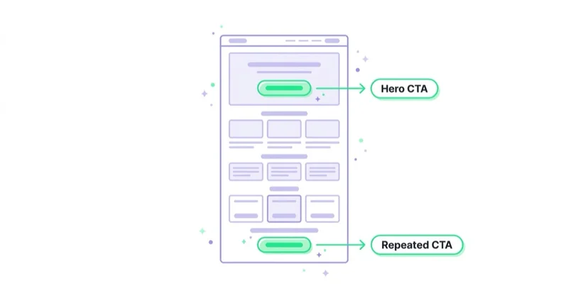
A strong structure:
- Problem or user intent.
- Clear promise.
- Benefit explanation.
- Proof or credibility.
- Process or expectation.
- CTA.
- Reassurance or microcopy.
Some visitors are ready immediately, so a CTA near the top can work. Other visitors need proof first. Repeating the same main CTA after key sections is often better than adding different competing actions.
CTA in ecommerce
Ecommerce CTAs are tied to buying behaviour.
Common ecommerce CTAs:
- Add to cart;
- Buy now;
- Choose size;
- Select colour;
- Continue checkout;
- Apply discount code;
- Get back-in-stock alert;
- Add to wishlist;
- Compare products;
- Reorder.
The CTA rarely works alone. It needs support from:
- product photos;
- price;
- stock status;
- delivery date;
- return policy;
- payment methods;
- reviews;
- size guide;
- warranty;
- security signals.
For conversion improvements around product and checkout journeys, see how to increase online sales.
CTA after the click
CTA optimisation does not end at the click. The next screen, form, checkout step or confirmation message must fulfil the expectation created by the CTA.
After-click problems include:
- the form asks for more data than expected;
- the landing page headline does not match the ad or CTA;
- the checkout reveals additional delivery costs too late;
- the calendar has no available dates;
- the download is hidden behind another step;
- the thank-you page does not explain what happens next;
- the sales team receives unqualified or incomplete leads;
- the user cannot return easily to the previous step.
For lead generation, the post-click experience should explain response time and next steps. For example: "Send enquiry" can be supported with "A strategist will reply within one business day." For checkout, the CTA should be followed by predictable payment, delivery and return information. For content downloads, the user should receive the promised file quickly and understand whether they will also receive emails.
This is important for SEO and paid traffic because the page may win the click but still lose the conversion. Search engines, ad platforms and users all respond poorly to experiences where the promise and the landing experience do not match.
CTA accessibility
CTA quality includes accessibility. A CTA that cannot be used with a keyboard, screen reader or touch device is not effective.
Important rules:
- use clear link or button text;
- make focus states visible;
- avoid relying only on colour;
- keep text readable;
- give buttons enough tap area;
- do not place critical CTAs where they are covered by chat widgets or pop-ups;
- use buttons for actions and links for navigation where possible;
- make disabled states understandable or avoid them;
- ensure the CTA purpose is clear from text or context.
Accessibility also improves clarity for all users, especially on mobile.
How to test CTAs
CTA tests should be based on a hypothesis.
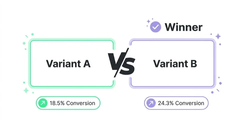
Weak test:
- Change button colour and see what happens.
Stronger test:
- If the CTA explains the outcome more clearly, more qualified users will start the form.
- If delivery reassurance is shown next to Add to cart, product-page-to-cart rate should improve.
- If a softer CTA is used for cold traffic, guide downloads should increase without reducing lead quality.
- If the form after the CTA is shortened, completed enquiries should increase.
Testable elements:
- CTA copy;
- placement;
- visual hierarchy;
- supporting microcopy;
- number of CTAs;
- form length;
- commitment level;
- mobile sticky CTA;
- trust signals;
- landing page section order;
- offer framing.
Do not test the button in isolation when the real problem is the offer, audience, page speed, form or lack of trust.
How to measure CTA performance
Track CTA performance as part of the full journey.
Useful metrics:
- click-through rate;
- form start rate;
- form completion rate;
- add-to-cart rate;
- checkout start rate;
- purchase rate;
- lead quality;
- demo attendance;
- revenue;
- assisted conversions;
- scroll depth before click;
- mobile versus desktop behaviour;
- repeat clicks or rage clicks;
- downstream retention.
In GA4, important actions can be marked as key events when they represent meaningful business outcomes. Not every CTA click should become a key event. A pricing-page view may be useful as a micro conversion, while a purchase or qualified lead is usually a macro conversion.
How we approach this at Space Ads
The commonest CTA mistake is asking for too much, too soon. So the call gets matched to the stage the audience is at. Someone meeting the brand for the first time is rarely ready for "buy now"; "see how it works" or "browse the collection" lands better, a smaller step that also builds a remarketing audience we can say more to later. One clear action per screen, because two equal buttons blur the decision. And the wording itself gets tested — a small change of verb can move click-through more than you'd expect, so we don't settle "the better CTA" at a desk, we settle it on live traffic. A call matched to readiness usually beats the loudest "act now".
Common CTA mistakes
Generic labels
"Click here" and "Learn more" are often too vague. Specific labels usually help users understand the next step.
Too many competing CTAs
Several equal buttons can dilute attention. Use one primary CTA and secondary actions only where they genuinely help.
Mismatch with user intent
A hard sales CTA on an early educational page can feel premature. A soft educational CTA on a high-intent pricing page can slow users down.
No explanation after the click
Users should know what happens after form submission, checkout start or consultation booking.
Weak mobile visibility
Small buttons, hidden CTAs and competing sticky elements can reduce mobile conversion.
Testing colour instead of value
Colour can matter for contrast, but usually not more than the offer, copy, page structure and friction.
CTA audit checklist
Use this checklist before changing button colour or launching an A/B test:
- Is the primary CTA visible without fighting several equal actions?
- Does the CTA text describe the outcome or next step?
- Is the CTA aligned with the user's funnel stage?
- Is the level of commitment realistic for the page context?
- Is the supporting copy strong enough to justify the action?
- Are risk reducers visible near high-commitment CTAs?
- Does the mobile version keep the CTA readable and tappable?
- Is the next step after the click consistent with the promise?
- Are form fields, checkout steps or booking steps shorter than necessary?
- Are CTA clicks tracked separately from meaningful conversions?
- Are micro-conversions and macro-conversions defined clearly?
- Is lead quality or revenue checked, not only click volume?
The checklist is useful because CTA issues are often symptoms. If a page has weak positioning, unclear pricing or poor proof, changing "Contact us" to "Get started" will not solve the real problem. A CTA should be reviewed together with the offer, page structure, traffic source and conversion path.
FAQ
What does CTA mean?
CTA stands for call to action. It is a prompt that tells a user what action to take next, such as buying, subscribing, downloading, booking or contacting.
What makes a CTA effective?
An effective CTA is clear, specific, visible, aligned with user intent and supported by enough context to make the action feel worthwhile.
Should a CTA be written as a command?
Not always. Neutral and descriptive CTAs often work well, such as "View pricing", "Download checklist" or "Book consultation". The wording should fit the brand and decision stage.
How many CTAs should a landing page have?
A landing page can repeat the same primary CTA in several sections. It can also include secondary CTAs, but one main action should remain dominant.
Does CTA colour matter?
Colour matters for contrast and visibility. There is no universal best CTA colour. A button should stand out from the page while remaining accessible and consistent with the design system.
How should CTA success be measured?
Measure click rate, completion rate, conversion rate and downstream quality. A CTA that gets more clicks but worse leads or fewer purchases may not be an improvement.
What is the best CTA for lead generation?
The best lead generation CTA explains the next step and reduces uncertainty. "Book a 20-minute consultation", "Request a media audit" or "Get a proposal" is usually clearer than a generic "Contact us".
What is the best CTA for ecommerce?
The best ecommerce CTA depends on the product stage. Product pages often need "Add to cart" or "Choose size", while unavailable products may need "Get back-in-stock alert" and returning customers may need "Reorder".
Conclusion
A CTA works when it makes the next step obvious and worthwhile. Strong CTA optimisation is not about shouting louder. It is about matching the action to user intent, reducing uncertainty, supporting the promise with proof and measuring what happens after the click.
The best CTA is specific enough to be understood, visible enough to be found, accessible enough to be used and aligned enough with the funnel stage to feel natural. When those elements are in place, small copy and design tests become much more meaningful.
Sources and further reading
- Google Analytics Help: About key events
- W3C WCAG 2.2
- W3C Design System: Buttons
- Google Search Central: Helpful, reliable, people-first content
Continue learning
Continue reading
What Is Benefit-Led Copywriting and How to Use It?
Benefit-led copywriting translates features into customer value. Learn feature vs advantage vs benefit, with examples for ads, ecommerce, B2B, landing pages and CTAs.
What Is a Sales Funnel and How to Use It?
A sales funnel helps organise content, campaigns, sales activity and measurement around the stages people pass through before and after conversion.
Website Marketing: How to Actually Drive Revenue From Your Site
A website creates commercial value when it helps the right people complete the right task and gives the business reliable feedback. This guide connects audience journeys, acquisition, experience, measurement and experimentation.