Color psychology in web design is the practice of using colour to support brand perception, visual hierarchy, readability and user decisions. It does not mean that one colour always sells better than another. In real projects, context, contrast, accessibility, layout, copy, offer strength and user intent usually matter more than a simple "red means urgency" rule.

Colour can help users understand what is important, where to click, what has changed and how a brand should feel. It can also damage conversion when everything looks equally important, text is hard to read, error states rely only on red, or call-to-action buttons blend into the interface.
The useful question is not "which colour converts best?" The useful question is: does the colour system help users understand, trust and complete the next step?
TL;DR
- Colour can support emotion, hierarchy and recognition, but it cannot fix a weak offer or poor UX.
- There is no universal best CTA colour.
- CTA colour works when it has enough contrast, a clear label and the right position in the journey.
- Colour meanings depend on category, culture, brand, user expectation and surrounding design.
- Accessibility is not optional. Colour should never be the only way to communicate meaning.
- WCAG contrast requirements should guide text, UI states and meaningful graphics.
- A/B tests should evaluate the full context, not only "green button vs orange button".
- For ecommerce, colour should support product choice, variant selection, trust, promotions and checkout clarity.
- A practical colour system separates brand colour, primary action colour, semantic states and neutral UI foundations.
What is color psychology?
Color psychology studies how colours can influence perception, emotion and behaviour. In marketing and UX, it is used to support brand meaning, attention, trust and decision-making.
However, the commercial version of color psychology is often oversimplified.
Examples:
- red can signal urgency, error, danger, discount, energy or celebration;
- blue can signal trust, calm, technology or coldness;
- green can signal nature, health, success, growth or finance;
- black can signal premium, elegance, simplicity or severity;
- yellow can signal optimism, attention or warning;
- purple can signal creativity, beauty, luxury or spirituality.
These associations are not fixed laws. They are starting hypotheses. The same colour can help in one category and hurt in another.
Why colour matters in web design
Colour affects several layers of user experience:
- first impression;
- brand recognition;
- readability;
- visual hierarchy;
- attention direction;
- perceived professionalism;
- trust;
- error and success communication;
- product variant recognition;
- accessibility;
- emotional fit with the offer.
Colour is strongest when it supports an already clear design. It is weakest when it tries to compensate for unclear copy, confusing layout or a poor offer.
Common colour associations
The table below describes typical associations in many Western commercial contexts. It should not be treated as a conversion formula.
| Colour | Common associations | Possible use |
|---|---|---|
| Red | urgency, error, sale, energy, warning | promotions, alerts, limited accents |
| Blue | trust, calm, stability, technology | B2B, finance, SaaS, expert services |
| Green | nature, success, health, growth | eco, wellness, confirmations, finance |
| Black | premium, elegance, power, minimalism | fashion, luxury, high-end products |
| Orange | energy, friendliness, accessibility | consumer offers, accents, action areas |
| Yellow | optimism, attention, warning | highlights, notices, playful brands |
| Purple | creativity, beauty, premium, imagination | beauty, education, creative products |
| White | clarity, simplicity, space | minimalist brands, content readability |
| Grey | neutrality, support, structure | backgrounds, secondary UI, balance |
The important part is context. A red CTA on a clean white page may stand out. A red CTA inside a site full of red alerts may be confusing. A blue brand can feel reliable in financial services and generic in a creative category.
CTA colour: what really matters
There is no best call-to-action colour.
What matters:
- the CTA contrasts with the surrounding interface;
- the button label explains the action;
- the page explains why the action is worth taking;
- the CTA appears at the right moment;
- the colour is used consistently for primary actions;
- secondary actions are visually quieter;
- disabled, hover, focus and active states are clear;
- the CTA does not compete with many other bright elements.
If every banner, badge, icon and button uses the same high-saturation accent colour, the CTA loses visual priority.
In many projects, conversion improves not because the button changes from green to orange, but because the button becomes easier to notice, the label becomes clearer or the surrounding content reduces hesitation.
For broader funnel context, see how to increase online sales.
For CTA copy and placement, see CTA optimisation.
Colour decision matrix
Colour decisions become easier when each colour has a job. Without a system, teams often add another bright accent whenever a page feels weak.
| Colour role | Job | Good use | Common mistake |
|---|---|---|---|
| Brand colour | Recognition and identity | Logo, brand accents, selected highlights | Using it for every button and badge |
| Primary action | Main user action | Add to cart, book demo, submit form | Competing with promotions and banners |
| Secondary action | Helpful but lower-priority action | Learn more, compare, save for later | Looking identical to the primary CTA |
| Semantic colour | Meaningful state | Success, error, warning, info | Communicating meaning only through hue |
| Neutral colours | Structure and readability | Text, backgrounds, borders, dividers | Low-contrast grey text |
| Product colour | Actual product attribute | Swatches, variant labels, filters | Showing inaccurate or unnamed swatches |
This matrix prevents a common conversion problem: the design may look colourful, but the user cannot tell what matters. A well-designed colour system makes the next step obvious without making the whole interface loud.
Contrast and readability
Contrast is often more important than hue.
Users need to read text, distinguish actions and understand states quickly. This is especially important on mobile screens, in bright environments, for older users and for people with low vision or colour vision deficiencies.
WCAG 2.2 includes contrast requirements such as:
- normal text should have at least 4.5:1 contrast at level AA;
- large text should have at least 3:1 contrast at level AA;
- non-text UI components and meaningful graphics should have sufficient contrast;
- colour should not be the only way to communicate information.
In practice:
- do not use light grey text on white backgrounds for important content;
- avoid low-contrast pastel buttons with small text;
- ensure form errors use text, icons or messages, not only red borders;
- make focus states visible for keyboard users;
- check hover and disabled states;
- test dark mode separately;
- check contrast after brand colours are applied, not before.
Accessibility is not separate from conversion. If users cannot read, understand or operate the interface, they cannot convert.
Colour should not be the only signal
A common accessibility and usability mistake is using only colour to communicate meaning.
Risky examples:
- "fields in red are required";
- "green means available, red means unavailable";
- error state shown only with a red border;
- chart series separated only by colour;
- selected filters indicated only by a colour change;
- sale prices shown only in red with no label.
Better patterns:
- add text labels;
- add icons where useful;
- use patterns or shapes in charts;
- show clear error messages;
- include colour names for product variants;
- use focus indicators;
- use aria labels and semantic markup where relevant.
Colour is a powerful supporting cue, but it should not carry the full meaning alone.
Brand colour vs conversion colour
A brand colour is not automatically the best conversion colour.
Brand colours should express identity and recognition. UI colours should support interaction. Sometimes they overlap. Sometimes they need separation.
A practical colour system usually includes:
- primary brand colour;
- secondary brand colour;
- neutral background colours;
- text colours;
- primary action colour;
- secondary action style;
- success colour;
- warning colour;
- error colour;
- information colour;
- focus outline colour;
- disabled state colour.
The system should define where each colour is used. Without that governance, designers and marketers often add more colours whenever a page feels weak. The result is visual noise.
Industry context matters
Colour choices should match category expectations without becoming generic.
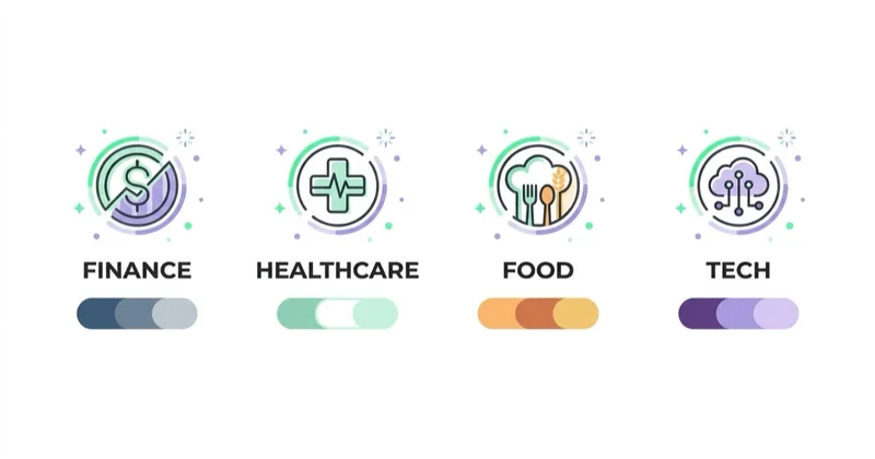
Examples:
- A fintech website may need stability, clarity and high trust.
- A beauty brand may use softer or more expressive palettes.
- A healthcare site needs calm, accessibility and credibility.
- A discount retailer may use stronger promotion colours.
- A luxury brand may rely on restraint, spacing and contrast.
- A B2B software product may use a quieter palette for dense workflows.
- A children's product may support brighter colours, but still needs accessibility.
The right palette depends on brand position, audience, device context and decision risk.
For example, a high-risk B2B purchase may not benefit from aggressive urgency colours, while a short seasonal sale may need stronger promotional contrast.
Colour in ecommerce
In ecommerce, colour should help users choose and buy with less friction.
Review:
- whether product variants use clear swatches and colour names;
- whether active swatches are easy to identify;
- whether unavailable variants are visually and textually clear;
- whether the add-to-cart button is consistent;
- whether promotional prices are visible but not confused with errors;
- whether delivery, return and stock messages are readable;
- whether checkout errors include clear explanations;
- whether badges and discounts compete with the CTA;
- whether product photos show colour accurately;
- whether dark, white or reflective products remain visible in images.
For product-led sales, colour work is connected with product imagery, product data, reviews and page UX. It is not only a branding decision.
Colour in forms and checkout
Forms and checkout flows need clarity more than decoration. Colour should help users understand progress, errors, trust and the next action.
Important checks:
- required fields should be marked with text or structure, not only colour;
- errors should include readable messages and clear field association;
- success states should confirm what changed;
- disabled buttons should explain what is missing when possible;
- payment, delivery and return information should be readable;
- the primary checkout CTA should remain visually dominant;
- promotional badges should not look like errors;
- focus states should be visible for keyboard users;
- mobile sticky CTAs should not hide form fields or warnings.
Checkout colour choices can affect trust. Aggressive urgency colours may work for short promotions, but they can also increase anxiety in high-value purchases. For expensive products, subscriptions, B2B forms or regulated categories, calm hierarchy and reassurance are often more useful than visual pressure.
Colour in services, SaaS and B2B
For services and B2B, colour often affects perceived trust and clarity.
Useful checks:
- Does the page feel credible for the price point?
- Are primary and secondary actions distinct?
- Are case studies and proof easy to scan?
- Do charts and dashboards remain readable?
- Does the colour system support long-form content?
- Are form states clear?
- Does the design look too playful for a high-risk decision?
- Does the design look too cold for a relationship-led service?
In B2B, the goal is often confidence rather than impulse. Colour should help make complex information easier to understand.
Colour in dashboards, charts and reports
Many marketing and SaaS interfaces include dashboards, comparison tables or reports. Colour should make data easier to read, not more impressive.

Useful rules:
- avoid using red and green as the only difference between good and bad results;
- label chart series directly where possible;
- keep enough contrast between lines, bars and backgrounds;
- use semantic colours consistently across dashboards;
- do not use too many saturated colours in one chart;
- make negative, neutral and positive states understandable with labels;
- check charts for colour vision deficiencies;
- avoid decorative gradients that reduce data readability.
This matters for decision-making. A dashboard that looks modern but hides weak contrast can lead to slower analysis, misread trends and lower trust in the data.
A/B testing colour changes
A/B testing can be useful, but colour tests are often poorly designed.
Avoid tests such as:
- only changing button colour while the CTA is hard to see for other reasons;
- testing a colour that breaks brand consistency;
- running tests on too little traffic;
- treating one result as a universal rule;
- ignoring device differences;
- ignoring returning users who already know the old design.
Better tests evaluate:
- CTA contrast and label together;
- button hierarchy;
- form error visibility;
- product variant selection;
- promotional badge hierarchy;
- checkout clarity;
- page section emphasis;
- dark vs light interface variants;
- trust signal placement.
The test question should be behavioural: can users identify and complete the next step more easily?
How to audit colour on a live website
Use this practical audit before redesigning a palette:
- List all colours used across the site.
- Identify the primary action colour and check whether it is consistent.
- Check body text, captions, buttons, forms, overlays and badges for contrast.
- Review whether error, warning, success and info states use both colour and text.
- Compare desktop and mobile views.
- Check product pages, landing pages, forms, checkout and pop-ups separately.
- Look for competing accents that reduce CTA visibility.
- Review analytics or session recordings for hesitation around forms and key CTAs.
- Test proposed changes with real content, not only design mockups.
- Document final usage rules so the palette does not drift again.
For overlays and interruption patterns, see how to use pop-ups without hurting UX or SEO.
For a broader conversion framework, see conversion rate optimization.
How to build a practical colour system
1. Define brand and use case
Clarify audience, category, price point, risk level and emotional position.
2. Choose neutral foundations
Text, backgrounds and borders should support readability before accent colours are added.
3. Pick one primary action colour
The primary CTA should be easy to identify across the site.
4. Define semantic colours
Success, warning, error and information colours should be consistent and supported by text.
5. Design all states
Include default, hover, focus, active, disabled, error and selected states.
6. Check contrast
Validate body text, buttons, links, forms, badges, charts and overlays.
7. Test in real contexts
Check mobile, sunlight, dark mode, product images, modals, popups and long pages.
8. Document usage rules
A small design token system can prevent colour sprawl as the site grows.
The system does not need to be complex. Even a short document with colour roles, contrast rules, button hierarchy and examples of error states can save many future design inconsistencies.
How we approach this at Space Ads
There's no magic "colour that converts", and we don't pretend otherwise. The "green beats red" myth skips what actually matters: contrast, legibility, and standing out from the rest of the page. A CTA wins by being visible and unambiguous, not because a shade carries some psychological charge — the same "magic" colour dies the moment the whole page wears it. So rather than theorise about colour meanings, we make the action the highest-contrast element on screen, keep it on-brand, and let an A/B test on live traffic settle the rest. Colour theory is a starting point, never a verdict: what converts in one shop can flop in another with a different palette and audience. Visibility and a clear choice decide it, not symbolism.
Common mistakes
| Mistake | Why it hurts | Better approach |
|---|---|---|
| Treating colours as universal rules | Ignores brand and context | Use colour meaning as a hypothesis |
| Too many accent colours | Weak hierarchy | Reserve accent colour for important actions |
| Low contrast text | Poor readability | Check WCAG contrast |
| Colour-only error states | Accessibility and clarity risk | Add text and icons |
| Brand colour used for everything | CTA disappears | Separate brand and UI roles |
| Testing button colour alone | Misleading result | Test visibility, copy and context |
| Ignoring mobile | Colours behave differently on small screens | Test on real devices |
| Using red and green only for status | Colour vision risk | Add labels and shapes |
FAQ
What is color psychology in web design?
Color psychology in web design is the use of colour to support perception, hierarchy, emotion, readability and user decisions. It should be applied with context and accessibility in mind.
What colour CTA converts best?
There is no universal best CTA colour. The best CTA is usually the one that has clear contrast, strong copy, the right placement and enough surrounding context.
Is color psychology a myth?
No, but it is often oversimplified. Colours can influence perception, but their meaning depends on culture, category, brand, layout and user expectation.
How many colours should a website use?
Most websites work better with a limited system: neutrals, one primary action colour, supporting brand colours and semantic colours for error, success, warning and information states.
Does colour accessibility affect conversion?
Yes. If text, buttons, errors or product options are hard to see, users struggle to complete actions. Accessibility supports usability and conversion.
Should ecommerce CTA buttons always be green?
No. Green can work, but the real requirement is visibility, clarity and consistency. The button should stand out from the interface and make the next action obvious.
Should error messages be red?
Red is common for errors, but it should be paired with text, icons or clear messages. Colour alone should not carry the meaning.
How should colours be chosen for forms?
Forms should prioritise readability, visible labels, clear errors and a dominant primary action. Colour can support the flow, but field requirements and validation messages should not rely only on colour.
Should brand colour always be used for CTA buttons?
Not always. A brand colour can work as the CTA colour when it has strong contrast and is not overused elsewhere. If the brand colour appears everywhere, a separate primary action style may be clearer.
Conclusion
Color psychology is useful when it supports real UX decisions: readability, hierarchy, trust, action clarity and brand consistency. It becomes weak when reduced to generic claims that one colour always sells better.
The best colour systems are contextual, accessible and tested. They make important actions visible, keep text readable, communicate states clearly and help users feel that the brand is credible for the decision they are making.
Sources and further reading
- W3C: WCAG 2.2
- W3C: Understanding Contrast Minimum
- MDN: Understanding colors and luminance
- Nielsen Norman Group: Using color to enhance your design
- European Commission: European Accessibility Act
Continue learning
Continue reading
The latest trends in designing websites / e-commerce platforms
Modern website and ecommerce design is less about chasing visual trends and more about making the offer fast, accessible, mobile-friendly, crawlable, measurable and easy to buy from. This guide explains how Core Web Vitals, WCAG-informed UX, CRO, structured content, AI search readiness, product data and platform architecture should shape a redesign.

WCAG 2.2 and Conversion: Where Accessibility Pays for Itself
Many WCAG 2.2 criteria address the same barriers a sound usability review finds in forms, checkout and login: invisible focus, missing labels, unclear errors and controls that are hard to operate. Learn how to test them, prioritise remediation and understand the EAA context.

How Much Does a Landing Page Cost?
A landing page can cost a few hundred dollars or more than $10,000 because the scope may cover only implementation—or research, copy, design, tracking, integrations and optimisation. Compare deliverables, not just quotes.