Modern website and e-commerce platform design is no longer mainly about visual trends. In 2026, the strongest websites combine fast performance, accessible interfaces, mobile-first journeys, clear positioning, conversion-focused layouts, reliable analytics and structured content that can be understood by search engines and AI answer systems. Visual style still matters, but it should support trust, usability and business outcomes.
For commercial websites, the useful question is not "which visual trend looks modern?". The useful question is: can the right visitor understand the offer, trust the brand, complete the next step and return through measurable marketing channels without friction? That applies to e-commerce stores, SaaS websites, B2B lead generation, local services, marketplaces and content-led brands.
TL;DR
- Performance is part of design. Core Web Vitals, JavaScript weight, image strategy and third-party scripts affect UX before a user reads the first paragraph.
- Accessibility is a design, legal and commercial priority. WCAG 2.2 and the European Accessibility Act make inclusive interfaces more important for websites and e-commerce services.
- Mobile-first design means designing the real journey for small screens, not shrinking a desktop layout after the fact.
- CRO matters more than visual novelty. A beautiful page that hides the value proposition, slows loading or adds form friction will usually underperform.
- E-commerce design should follow merchandising logic. Product data, category structure, stock, returns, delivery, variants and checkout all shape the experience.
- AI search rewards clear, crawlable and well-structured content. Definitions, FAQ, schema, author/company context and internal links help make pages easier to understand.
- Platform choice should match business complexity. Shopify, WooCommerce, BigCommerce, headless commerce and custom builds all have trade-offs.
- A redesign should start with evidence. Audit performance, accessibility, analytics, SEO, conversion paths and user objections before changing the visual layer.
What has changed in website design
Older web-design trend articles often focused on visible style: gradients, brutalism, glassmorphism, dark mode, hero videos, parallax effects, animated typography or experimental layouts. Those elements still appear, but they rarely decide whether a website performs.
The stronger 2026 conversation is about fundamentals:
- how quickly the page becomes useful;
- whether the offer is clear in the first screen;
- whether mobile users can complete the task;
- whether disabled users can access key journeys;
- whether search engines can crawl and understand the content;
- whether AI systems can extract accurate answers;
- whether analytics and consent are implemented correctly;
- whether landing pages convert traffic profitably;
- whether the CMS and platform can be maintained after launch.
Design is no longer only a visual layer. It is the connection between product, content, brand, performance, accessibility, analytics and conversion. A website can look contemporary and still fail if the checkout is confusing, the lead form is too long, product data is weak or tracking cannot measure the result.
Core Web Vitals: performance as a design baseline
Google's Core Web Vitals measure loading, interactivity and visual stability. The current set includes:
| Metric | What it measures | Good threshold |
|---|---|---|
| LCP - Largest Contentful Paint | Loading performance of the main content | 2.5 seconds or faster |
| INP - Interaction to Next Paint | Responsiveness to interactions | 200 ms or faster |
| CLS - Cumulative Layout Shift | Visual stability during loading | 0.1 or lower |
INP replaced FID as a Core Web Vital in March 2024, so audits that still focus only on FID are outdated. The practical implication is simple: interactive components, tag managers, third-party scripts, heavy product grids, sliders and personalization tools can damage the felt quality of the site.
Performance is not only an SEO topic. It affects trust. A slow premium store feels less premium. A form that lags after every field feels risky. A checkout button that moves while payment widgets load can create doubt before payment.
Practical performance priorities:
- optimize above-the-fold images and avoid oversized hero media;
- use responsive images and modern formats such as WebP or AVIF;
- reduce unused JavaScript and CSS;
- defer non-critical scripts;
- review tag-manager load and third-party embeds;
- avoid layout shifts from fonts, banners, ads, reviews and payment widgets;
- test key templates on real mobile devices;
- measure field data where possible, not only lab scores.
For conversion context, read What Is Conversion Rate Optimization (CRO) and How Does It Increase Sales?.
Accessibility and inclusive design
Accessibility should be designed in from the beginning, not patched at the end. WCAG 2.2 became a W3C Recommendation in October 2023. In the EU, the European Accessibility Act entered into application on 28 June 2025 and covers key products and services, including digital services and e-commerce contexts.
This does not mean every business has the same legal exposure in every market. It does mean accessibility is no longer a niche checklist for public-sector websites. For many international brands, it is now part of market access, user experience, compliance risk and conversion.
Practical accessibility priorities:
- keyboard navigation for menus, modals, forms, filters and checkout;
- visible focus states;
- sufficient color contrast;
- semantic headings;
- descriptive link text;
- labels and error messages for form fields;
- accessible names for icon buttons;
- captions or transcripts for important video/audio;
- no critical information conveyed only by color;
- support for zoom and responsive layouts;
- respect for
prefers-reduced-motion; - usable cookie banners and consent flows.
Accessibility is also CRO. Clear forms, readable text, predictable navigation and fewer interaction traps help more users complete the task.
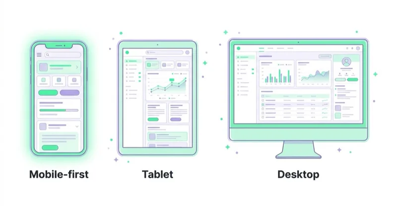
Mobile-first UX is still underdeveloped
Mobile-first does not mean compressing a desktop layout into a narrow viewport. It means designing the main user journey for a phone first.
Mobile users deal with:
- smaller screens;
- touch input;
- interrupted attention;
- weaker connections;
- browser UI taking visible space;
- autofill and payment-wallet behavior;
- lower processing power on cheaper devices;
- one-handed use and thumb zones.
Mobile design priorities:
- put the value proposition high on the page;
- keep the main CTA visible and unambiguous;
- use large, stable tap targets;
- avoid hover-only interactions;
- make forms short and autofill-friendly;
- support Apple Pay, Google Pay and local payment methods where relevant;
- keep product filters usable in listings;
- make product images swipeable but lightweight;
- ensure sticky bars do not cover content;
- test popups, cookie banners and chat widgets on small screens.
For B2B and services, mobile still matters even if the final conversion happens later on desktop. Research, first impressions, internal sharing and retargeting often start on mobile.
Conversion-focused layout
CRO-focused design starts with intent. Each important page should answer:
- What is being offered?
- Who is it for?
- Why should it be trusted?
- What happens next?
- What objections might stop action?
- What proof supports the claim?
- What information is needed before the user commits?
For service pages, this usually means:
- clear positioning above the fold;
- concise proof points;
- service scope;
- process explanation;
- examples or case studies;
- FAQ;
- visible contact, booking or audit CTA;
- no vague hero copy that could fit any agency.
For e-commerce pages, this usually means:
- clear product title and variant selection;
- strong product imagery;
- price, delivery and return information visible early;
- reviews or trust signals;
- size, fit, compatibility or material guidance;
- product recommendations that support the purchase;
- transparent stock and delivery expectations;
- frictionless checkout.
Trends should never make the buying or enquiry path harder. A creative layout is useful only if it makes the offer clearer, the proof stronger or the next step easier.
For ecommerce-specific diagnostics, read How to Audit an Ecommerce Store.
E-commerce design is merchandising, not just UI
E-commerce platform design is not only front-end design. It is catalog architecture, merchandising logic and operational clarity.
Important layers include:
- category structure;
- product listing pages;
- filters and sorting;
- onsite search relevance;
- product data quality;
- variant handling;
- product images and videos;
- inventory status;
- pricing and promotions;
- shipping and returns;
- payment methods;
- checkout steps;
- analytics and consent;
- product feeds;
- email and remarketing flows.
A store can look modern and still fail commercially if product data is messy, category descriptions are thin, filters do not match how people shop, size guidance is missing or the checkout hides shipping cost too late.
Good e-commerce design connects UX with merchandising and media buying. The same product data can affect category filters, Google Shopping, Meta catalog ads, TikTok catalog ads, email personalization and onsite recommendations.
For category content context, read Are Category Descriptions Useful for Ecommerce SEO?. For feed context, read What Is a Product Feed and How to Use It?.
Product listing pages and category UX
Category pages and product listing pages often deserve more design attention than homepages. They are where commercial intent becomes product comparison.
Strong category UX usually includes:
- a concise intro that does not push products too far down;
- useful filters based on real buying criteria;
- sort options that users understand;
- product cards with meaningful names, prices, availability and images;
- clear sale, stock and delivery information;
- visible active filters and easy reset;
- crawlable links to important subcategories;
- helpful buying guidance below the product grid;
- FAQ for category-level objections;
- structured internal links to related collections.
Weak category UX often has beautiful cards but poor information. If every product name is truncated, filters are hidden, variants are unclear and delivery information appears only after checkout, design is not helping the buyer.
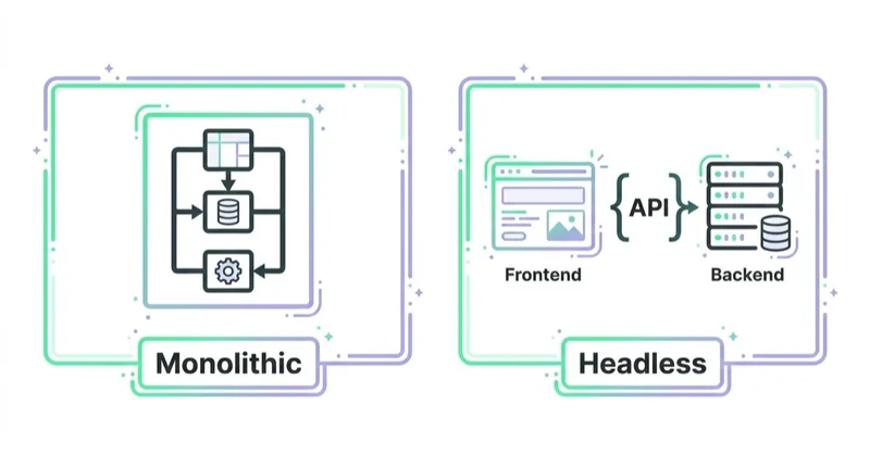
Platform and architecture choices
There is no universally best website platform. The right choice depends on revenue, complexity, team, integrations and maintenance capacity.
| Option | Good fit | Main trade-off |
|---|---|---|
| Shopify theme | Many DTC and SMB e-commerce stores | Fast launch, but deeper customization can hit limits |
| Shopify Hydrogen or headless Shopify | Larger brands needing custom UX and stronger performance control | Higher engineering and maintenance cost |
| WooCommerce + WordPress | Content-heavy stores and existing WordPress teams | Performance and maintenance require discipline |
| BigCommerce | Multi-storefront, B2B or more complex catalog needs | More implementation complexity than simple hosted builds |
| Composable or headless commerce | Enterprise, complex integrations and multiple markets | Expensive and easy to over-engineer |
| Static or hybrid site with CMS | Service businesses, content sites and lead generation | Needs integration planning for forms, analytics and editing workflow |
The platform should be chosen for the business model, not because it is fashionable. A headless build can be excellent when the business needs it. It can also be unnecessary overhead for a store that mainly needs a faster theme, cleaner tracking and better product pages.
For launch planning, read How to Start an Online Store and What You Need to Know.
AI search and structured content
AI search does not require a completely new website design discipline, but it rewards clarity and structure.
Useful practices:
- keep important content crawlable without relying only on client-side rendering;
- use clear headings and concise definitions;
- add FAQ where it genuinely helps users;
- use structured data such as
Product,Article,Organization,BreadcrumbListorFAQPagewhere appropriate; - make author, company and contact information clear;
- avoid hiding core content in inaccessible tabs or scripts;
- keep product data accurate;
- maintain helpful internal links;
- avoid vague claims without proof;
- use
llms.txtas an additional discovery and documentation surface where the site strategy supports it.
The goal is to make the site easier to understand. If a user, crawler or answer system cannot tell what the page offers, who it is for and why it should be trusted, the design is not doing its job.
Content design is part of website design
Many redesigns focus on components and ignore content structure. That is risky because content determines whether the layout can actually answer intent.
Modern content design should define:
- page purpose;
- primary user intent;
- supporting questions;
- proof points;
- objection handling;
- CTA sequence;
- internal links;
- schema needs;
- media requirements;
- content owner and update cadence.
For a service page, this can mean turning a vague "we help businesses grow" section into specific scope, process, proof and next steps. For an ecommerce category, it can mean replacing generic SEO text with buying guidance, comparison logic and relevant links.
For landing page structure, read What Is a Landing Page and How to Build One?.
Visual trends worth using carefully
Visual trends can help when they support the brand and do not hurt usability.
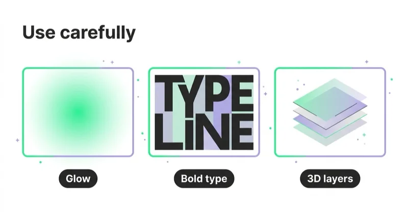
Reasonable 2026 patterns include:
- restrained motion for feedback and hierarchy;
- real product, team or customer photography instead of generic stock visuals;
- clear editorial layouts for educational content;
- modular landing-page sections that can be tested;
- strong typography with readable line lengths;
- dark mode only when contrast and readability are handled well;
- lightweight illustration systems that explain complex ideas;
- high-quality product imagery with fast loading;
- design tokens for colors, spacing and UI states;
- subtle personalization based on behavior or context.
Risky patterns include:
- heavy hero videos that hurt LCP;
- overdesigned animations that block reading;
- decorative AI imagery that weakens trust;
- tiny typography used for a "premium" effect;
- hidden navigation;
- auto-rotating carousels;
- popups that block the primary task;
- cookie banners that create layout shifts;
- chat widgets covering checkout buttons;
- one-size-fits-all personalization without consent and QA.
Visual style should express positioning, but it should not fight the user's task.
Analytics and measurement after a redesign
A redesign without measurement becomes subjective. Before changing major templates, define the baseline.
Measure:
- Core Web Vitals by page type;
- organic clicks and impressions by landing page;
- conversion rate by device and channel;
- checkout or form completion;
- revenue, average order value or lead quality;
- product-list click-through rate;
- internal search usage;
- filter usage;
- scroll and CTA interaction;
- accessibility issues fixed;
- consent impact on analytics;
- tracking integrity after deployment.
Google Analytics 4, Search Console, server logs, ecommerce platform data, CRM data and user research should be read together. A redesign can improve visual perception while damaging attribution, SEO or checkout completion if analytics is not validated.
For tracking context, read What Is Ecommerce Analytics and Why Is It So Important? and What Is Google Tag Manager and How to Use It?.
A practical redesign checklist
Before redesigning a website or e-commerce platform, check:
- current Core Web Vitals by template;
- mobile conversion path;
- accessibility issues;
- top landing pages by revenue or leads;
- checkout or form abandonment;
- internal-search queries;
- customer-service objections;
- product-feed quality;
- analytics and consent setup;
- SEO crawlability;
- internal linking;
- content gaps;
- CMS/editor workflow;
- future integration needs;
- redirect requirements;
- staging and QA plan.
Many websites do not need a full redesign first. They need a performance fix, checkout fix, analytics fix, accessibility pass, product-page upgrade or content restructure. A full redesign is justified when the current architecture blocks those improvements.
30-day website improvement plan
Days 1-5: Evidence
Collect data from analytics, Search Console, heatmaps, session recordings, CRM, customer support, ad platforms and page speed tools. Identify the templates that affect the most revenue or leads.
Days 6-10: UX and content audit
Review the main journeys: homepage, category, product page, service page, landing page, lead form, cart and checkout. Document unclear claims, missing proof, weak CTAs, accessibility issues and mobile friction.
Days 11-15: Technical checks
Check Core Web Vitals, JavaScript weight, image strategy, crawlability, canonical tags, redirects, structured data, consent behavior and tracking.
Days 16-20: Prioritization
Prioritize fixes by expected business impact, implementation effort and risk. Do not start with cosmetic redesign work if checkout, form or tracking issues are clearly larger.
Days 21-30: First implementation sprint
Ship a focused set of improvements: mobile hero clarity, form reduction, product-page trust blocks, category UX, performance fixes, accessibility fixes, tracking QA or landing-page restructuring. Measure before expanding scope.
Common mistakes
| Mistake | Why it hurts | Better approach |
|---|---|---|
| Designing desktop first | Mobile issues appear too late | Start with key mobile journeys |
| Chasing trends before fixing speed | Visual novelty cannot compensate for slow UX | Treat performance as a design requirement |
| Ignoring accessibility | Legal, ethical and conversion risk | Build to WCAG-informed patterns from the start |
| Overbuilding headless architecture | Higher cost without clear business return | Match architecture to actual complexity |
| Using generic imagery | Lower trust and weaker brand memory | Use real product, team, customer or custom visuals |
| Hiding delivery or pricing details | Users abandon late in the journey | Show key decision information earlier |
| No measurement plan | Redesign success becomes subjective | Define KPIs before design work starts |
| Treating AI search as a plugin | Tools cannot fix unclear content | Structure content and data properly |
| Launching without tracking QA | Results become hard to interpret | Test events, consent and conversions before launch |
| Rewriting content after design is done | Layouts cannot support real answers | Plan content and design together |
How we approach this at Space Ads
At Space Ads, we treat website and ecommerce trends as hypotheses, not design requirements. Before recommending a redesign, we audit mobile journeys, Core Web Vitals, accessibility, analytics, SEO crawlability, product data, forms, checkout, feed quality and the objections users need answered before they convert. For ecommerce, we connect UX decisions with merchandising, stock, delivery, returns, margin and campaign landing paths. For B2B and services, we connect page structure with positioning, proof, lead qualification and CRM outcomes. A trend is worth using only when it makes the offer clearer, the site faster, the content easier to understand or the next action easier to complete.
FAQ
What are the most important website design trends in 2026?
The most important trends are performance, accessibility, mobile-first UX, conversion-focused layouts, structured content for search and AI systems, better product/category UX and architecture that matches the business model. Pure visual effects are secondary.
Are Core Web Vitals still important?
Yes. Core Web Vitals remain a useful baseline for loading performance, responsiveness and visual stability. They should not be the only design metric, but ignoring them usually creates both UX and search problems.
Is headless commerce always better?
No. Headless commerce can improve flexibility and performance for complex stores, but it increases engineering cost. Many brands are better served by a well-optimized Shopify, WooCommerce or BigCommerce implementation.
Does every e-commerce site need a redesign?
No. Many stores need targeted improvements: faster product pages, better filters, clearer delivery information, improved checkout, stronger mobile UX or cleaner tracking. A redesign is useful when the current system blocks those improvements.
How does accessibility affect e-commerce?
Accessibility affects whether users can browse, compare, add products to cart and complete payment. It also matters for compliance in markets covered by accessibility regulation, including the EU under the European Accessibility Act.
Should AI-generated images be used on commercial websites?
They can be used carefully for supporting visuals, but they should not replace real product photography, team images, customer proof or visuals that need factual accuracy. Generic AI imagery can weaken trust.
What should be measured after a redesign?
Measure Core Web Vitals, organic traffic, conversion rate, checkout or form completion, revenue or lead quality, accessibility fixes, engagement with key sections, tracking accuracy and the performance of major landing pages.
What is the biggest ecommerce design mistake?
One of the biggest mistakes is treating the store as a visual project while ignoring product data, filters, delivery information, checkout friction and measurement. Ecommerce design needs merchandising and analytics, not only UI polish.
Key takeaways
Website and e-commerce design in 2026 is a performance and trust problem before it is an aesthetic problem. The best sites load quickly, work well on mobile, are accessible, explain the offer clearly, support search and AI understanding, and remove friction from the path to purchase or enquiry.
The strongest redesigns start with evidence. They use analytics, user research, accessibility checks, SEO data and conversion diagnostics to decide what should change. Visual direction matters, but it should be the result of a clear business and user-experience strategy.
Sources and further reading
- Google Search Central - Understanding Core Web Vitals and Google search results
- web.dev - Web Vitals
- web.dev - Interaction to Next Paint becomes a Core Web Vital
- W3C WAI - WCAG 2.2 is a W3C Recommendation
- European Commission - The EU becomes more accessible for all
- Google Search Central - AI features and your website
- Google Search Central - Creating helpful, reliable, people-first content
Continue learning
- What Is Conversion Rate Optimization (CRO) and How Does It Increase Sales?
- How to Audit an Ecommerce Store
- Are Category Descriptions Useful for Ecommerce SEO?
- What Is a Product Feed and How to Use It?
- What Is a Landing Page and How to Build One?
- How to Start an Online Store and What You Need to Know
Continue reading

What Is Color Psychology in Web Design?
Color psychology supports web design when it improves hierarchy, readability, trust and action clarity, not when it is treated as a universal colour formula.
How to Use Push Notifications
Push notifications can support sales, retention and service journeys when they are timely, permission-based, segmented, preference-aware and measured for incremental impact.

Are Product Recommendations Important?
Product recommendations can improve discovery, cross-selling, upselling and AOV when they are relevant, measured and privacy-aware.