A landing page can look polished and still make the next step difficult. The offer may not match the ad, the important information may be hard to find, the mobile experience may be slow, or the form may fail at the final step. These are useful diagnostic categories, but their impact varies by audience, traffic source and offer. Treat this guide as an audit sequence, not a universal ranking of conversion problems.
TL;DR
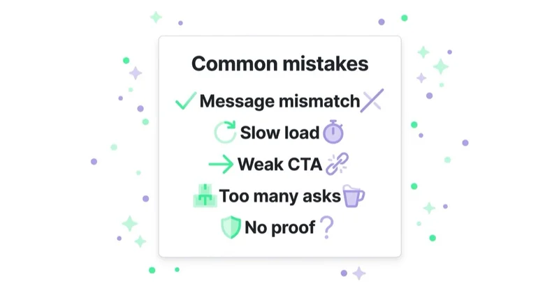
- Start with continuity: the page should fulfil the promise and intent created by the ad, email or search result.
- Make the primary path obvious, but do not remove useful navigation or secondary actions without understanding the decision journey.
- Test the devices your traffic actually uses. Review field data as well as a fast desktop preview.
- Ask only for data the current step needs and make every field accessible, clearly labelled and easy to correct.
- Place verifiable evidence where it helps evaluate a claim. Logos and testimonials are not substitutes for relevant proof.
- Explain the offer and next step plainly, including price, conditions or process where they matter.
- Measure the full path: landing, CTA interaction, form start, errors, completion and qualified outcome.
Mistake 1: the headline doesn't match the ad
A visitor should be able to recognise that the page delivers what the preceding message promised. Someone who clicks an ad for "same-day plumbing" and lands on a generic company introduction has to work out whether the service is actually available. Google Ads also treats landing-page relevance and usefulness as parts of landing-page experience.
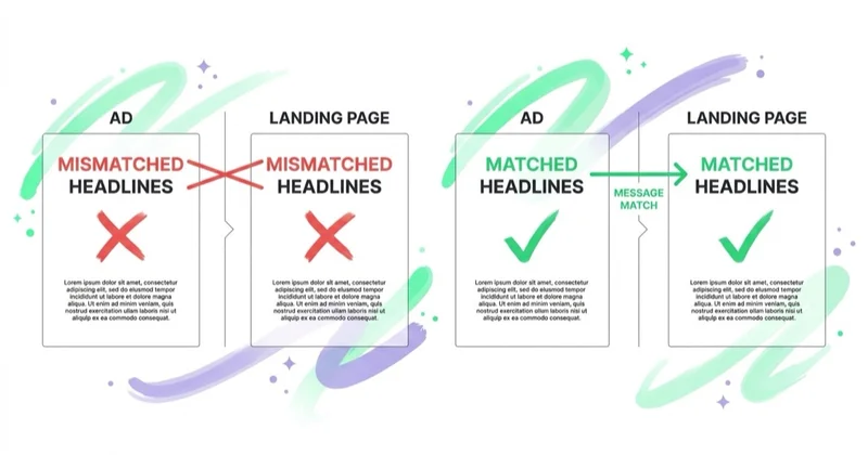
The page does not need to repeat the ad word for word. It needs to preserve the same offer, conditions, audience and next step. For paid search, address the query's intent; for paid social, continue the angle and product shown in the creative. A dedicated variant can improve continuity when campaigns make materially different promises, but duplicating pages without a real need creates maintenance and measurement problems. This is developed in PPC landing pages: why your ad clicks don't convert.
Mistake 2: too many choices
A campaign page usually has one primary outcome, but that does not mean every other link is a mistake. A visitor evaluating an expensive service may need pricing context, credentials, privacy information or a way to contact the company. The problem is an unclear hierarchy: competing offers and equally prominent buttons make it hard to identify the intended path.
Choose one primary action and make secondary actions visually subordinate. Review navigation link usage and user intent before removing it. On a focused lead-generation page, a reduced header may be appropriate; on a considered purchase, access to relevant supporting information may build confidence. Keep legally required and trust-critical links accessible in either case.
Mistake 3: a slow or awkward mobile page
If a meaningful share of campaign traffic is mobile, a desktop-only review leaves a major blind spot. Heavy media, unexpected layout shifts, delayed interactions, small touch targets and unsuitable input types can all make the page difficult to use. Check the device mix in analytics rather than assuming it is the same in every account.
Test on representative phones, browsers and network conditions. Review real-user or field data alongside lab tools. Google's current Core Web Vitals cover loading (LCP), responsiveness (INP) and visual stability (CLS), with "good" thresholds assessed at the 75th percentile. They are useful diagnostics, not a guarantee of higher conversion or search position. Optimise the actual bottleneck, which may be server response, an oversized hero, JavaScript, consent tooling or a third-party widget.
Mistake 4: the form asks for too much
A form asks the visitor to exchange data and effort for the promised next step. Unnecessary questions add friction, but field count alone does not decide performance. A quote, eligibility check or regulated service may genuinely require more information; hiding that work across steps does not remove it.
For every field, document why it is needed now and how it will be used. Use visible, programmatically associated labels, indicate required fields, choose appropriate input types, preserve entered data after an error and explain how to correct it. A multi-step form can organise a complex task, but it should show progress and be tested against a single-step alternative. The button should describe the real outcome—without promising an instant quote if the next step is only a sales call.
Glossary
- Message match — the headline confirming the ad or link that produced the click.
- Above the fold — the part visible before scrolling; its height varies by device and browser.
- CTA — call to action; the button that performs the page's goal.
- Friction — anything adding doubt, distraction or effort between arrival and conversion.
- Core Web Vitals — Google's page-experience metrics (loading, responsiveness, visual stability).
- Proof — verifiable evidence that supports a specific claim, such as documented results, reviews or credentials.
Mistake 5: weak or buried proof
A clear promise still needs support. Generic statements such as "trusted by many," unexplained customer logos or anonymous praise may add little because the visitor cannot assess relevance or credibility. Different claims require different evidence: a product-performance claim needs substantiation, a service claim may need a comparable case, and a security claim needs accurate controls or certification.
Place evidence close enough to the relevant claim that the relationship is clear. Give results a timeframe, baseline and scope where available; use customer quotes with permission; explain what logos represent; and state guarantee conditions rather than using the word as decoration. Do not publish fabricated reviews, selective numbers without context or client marks without approval.
Mistake 6: the offer isn't clear
Sometimes the page does not make the exchange clear. The visitor may not know what is included, who the offer is for, what it costs, what happens after the click or whether there are important conditions. A slogan can sound polished while answering none of these questions.
State the core offer and primary next step early, then provide the detail needed for the decision. The necessary detail varies: an impulse purchase, enterprise consultation and medical appointment cannot use the same information hierarchy. Test comprehension with people who were not involved in writing the page; internal familiarity hides ambiguity.
Mistake 7: nobody measures it
Without reliable measurement, the team cannot tell whether the problem occurs before the CTA, during the form or later in sales qualification. A thank-you-page event alone can also mislead when submissions are spam, duplicate leads or low-quality enquiries.
Define the business outcome first, then instrument the path: page view, meaningful CTA interaction, form start, validation errors, successful submission and qualified or completed outcome. Validate events and consent behaviour before using the data. Prioritise changes with quantitative and qualitative evidence. Run controlled experiments only when traffic and conversions can support a useful decision; otherwise, use larger evidence-led revisions and monitor them cautiously. This follows the same discipline as tying spend to outcomes in analytics.
How Space Ads approaches landing page mistakes
We treat the page, tracking and campaign as one acquisition path. The audit starts by mapping each ad promise to its destination and conversion event. We then reproduce the journey on representative devices, submit every form path, inspect event data and check what reaches the CRM. This separates a persuasion problem from a technical or lead-quality problem.
Priorities come from evidence: affected traffic, severity, confidence and implementation effort. A broken mobile form outranks copy refinement; a major promise mismatch may outrank a modest performance issue. Each recommendation states the observed problem, proposed change, expected mechanism and success measure. The page work lives in landing pages, inside conversion rate optimization and performance marketing.
Stop doing / Do instead
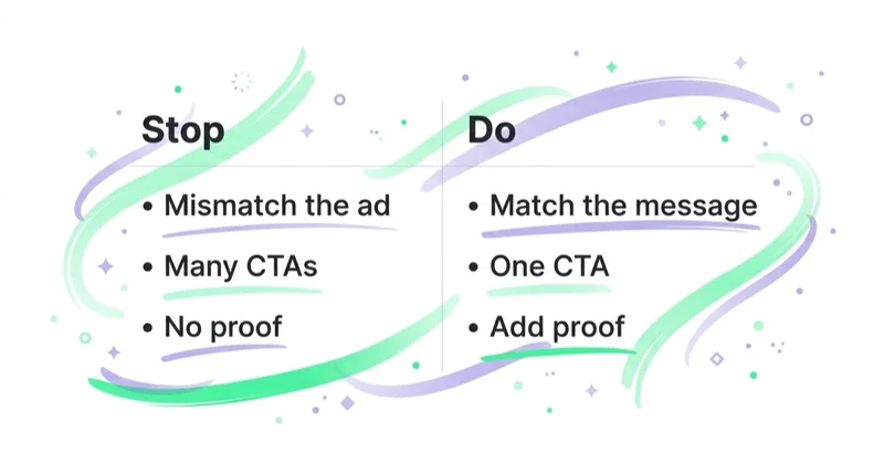
| Stop doing | Do instead |
|---|---|
| A page that changes the advertised promise | Preserve the offer, conditions and intent from click to page |
| Several equally prominent paths | Establish one primary action and justify secondary paths |
| Reviewing only on a fast desktop | Test representative devices and use field performance data |
| Asking for every field sales wants | Ask what the current step needs and make the form accessible |
| Generic testimonials and unexplained logos | Match verifiable evidence to the claim it supports |
| Describing the company in the hero | State the offer and next step plainly |
| Counting every form submit as success | Track errors, valid submissions and qualified outcomes |
FAQ
What is the biggest landing page mistake?
There is no universal biggest mistake. A broken form can make conversion impossible; a misleading offer can attract the wrong traffic; a slow mobile page can affect one campaign more than another. Start by confirming that the page works, that the offer matches the source and that the business outcome is measured correctly. Then prioritise with account data.
Why is my landing page getting traffic but no conversions?
First verify the traffic and measurement. Check whether the ads attract the intended audience, whether the page and form work on the actual device mix, and whether successful submissions reach the CRM. Then review message continuity, offer clarity, form errors and evidence. Low conversion can come from the campaign, page, tracking or follow-up—not only the design.
Should a landing page have a navigation menu?
It depends on the decision journey. A focused lead page may benefit from reduced navigation, while an expensive or complex purchase may require access to pricing, credentials, documentation or company information. Keep one primary action clear, retain necessary legal and trust links, and use behaviour or a controlled test before removing helpful paths.
How many form fields is too many?
There is no universal number. Ask only for information required for the current service, qualification or compliance need. A longer form may be justified for a complex request; a newsletter should usually need very little. Review completion and error data by field, and do not use multiple steps merely to hide the total effort.
Does mobile speed really affect landing page conversions?
Poor speed and responsiveness can obstruct the task, especially on slower devices or networks. Check the mobile share and real-user data for the page. Core Web Vitals help measure loading, responsiveness and visual stability, but passing them does not guarantee conversion. Test the complete journey, including consent tools, forms and third-party widgets.
How do I know which landing page mistake is costing me?
Track the full journey and validate the data: landing, CTA interaction, form start, field errors, successful submission and qualified outcome. Segment by source, campaign and device. Combine the funnel with session-level or user-research evidence, then test a specific hypothesis when sample size permits. Drop-off shows where to investigate, not automatically why it happened.
Key takeaways
- Diagnose the campaign, page, form, tracking and downstream lead quality as one system.
- Preserve the promise and intent from the traffic source without mechanically copying the ad.
- Make the primary action clear, but retain supporting paths that the decision genuinely needs.
- Test representative devices and build accessible forms with clear labels and errors.
- Track qualified outcomes and run controlled tests only when the data can support a decision.
Sources and further reading
- Google Ads Help — Optimise ads and landing pages
- Google Search Central — Understanding page experience
- web.dev — Core Web Vitals
- W3C Web Accessibility Initiative — Forms tutorial
Continue learning
Continue reading
PPC Landing Pages: Why Your Ad Clicks Don't Convert (and How to Fix It)
Clicks without business results can point to traffic quality, tracking, the landing page or follow-up. This guide shows how to diagnose the full PPC journey and improve message continuity, mobile use, forms and measurement.
High-Converting Landing Page Design: The Patterns That Actually Work
A strong landing page makes the offer, evidence and next step easy to understand for a specific audience. Learn how to design, measure and test message match, forms, proof, accessibility and performance.
Ecommerce Conversion Rate Benchmarks by Industry (and How to Read Them)
Published ecommerce conversion benchmarks often combine different formulas, stores, countries, devices, and traffic mixes. Learn how to qualify an industry comparison, reconcile Shopify and GA4, and build a decision-ready internal baseline.