A landing page should help a defined audience understand the offer, decide whether it is credible and take the intended next step. Visual design supports that job through hierarchy, readability, accessibility and feedback; it cannot rescue weak positioning, an uncompetitive offer or poor traffic quality.
There is no layout that “converts” in every market. A low-risk product purchase, a regulated medical enquiry and an enterprise demo require different information and levels of reassurance. The practices below are starting hypotheses. Validate them with user research, analytics and properly designed experiments.
TL;DR
- Use one primary outcome. Secondary links may still be necessary for privacy, accessibility, comparison or higher-consideration journeys.
- Continue the promise. The destination should clearly fulfil the offer and expectation created by the ad; word-for-word repetition is unnecessary.
- Build an information hierarchy, not a fixed template. Lead with relevance, then provide the proof, details and risk information this audience needs.
- Design for the actual device mix. Check analytics rather than assuming all paid traffic is mobile, and test the complete journey on representative devices.
- Ask for necessary data only. Explain why sensitive information is needed, use persistent labels and make errors easy to correct.
- Use verifiable evidence. Place substantiation where it helps evaluate a claim, with enough context to understand what the result means.
- Measure business quality. A higher form-completion rate is not a win if qualified leads or profitable orders fall.
Why landing page design is a different discipline
A homepage usually serves several audiences and tasks. A campaign landing page can narrow the message and establish one primary outcome. That focus does not mean removing every route by default. Visitors may need pricing, security, accessibility, legal or company information before they can decide, particularly for unfamiliar, expensive or regulated offers.
Copying a general homepage often creates a vague campaign destination, but stripping the page indiscriminately can also remove trust and orientation. Decide what to retain from the user's task: make the primary action visually clear, reduce irrelevant choices and keep information that supports an informed decision. Test navigation changes instead of presenting “no navigation” as a law.
For paid media, every unsuitable destination reduces the value of an already purchased visit. Diagnose the complete equation: traffic relevance, landing-page completion rate, downstream sales quality and margin. Improving an easy micro-conversion while attracting weaker customers can lower business value even when the platform CPA improves.
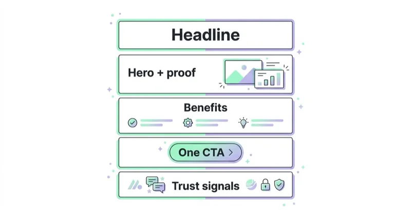
The anatomy of a high-converting landing page
The following structure is a useful design starting point, not a universal winning order. Research questions from sales calls, search terms, customer interviews and support tickets, then adjust the emphasis to the offer.
| Section | Job | The failure mode |
|---|---|---|
| Opening section | Identify the offer, audience and relevant next step | A slogan that makes the visitor infer what is offered |
| Initial evidence | Support the main claim with relevant, attributable proof | Unexplained logos or decontextualised numbers |
| Product, service or process detail | Explain what the customer receives and how it works | Benefits without enough information to assess the offer |
| Objection handling | Answer the reason the visitor would hesitate | Ignoring price, effort, risk or "will this work for me" |
| Social proof (specific) | Replace claims with evidence | Generic five-star quotes with no attribution |
| Repeat CTA | Convert once the visitor is ready | A single CTA at the top and nothing at the point of decision |
The appropriate order depends on the decision. Price may need to appear early for a standard product, while methodology, compliance and implementation detail may matter earlier in enterprise or regulated services. Make the offer understandable near the top, then order supporting information around the audience's questions rather than a copied template.
The hero has one job: match and promise
The opening section should continue the expectation created by the ad. If an ad offers a Google Ads waste audit, the page should make that audit easy to identify and explain what happens next. Google recommends consistency between ad and landing-page messaging, while noting that the search phrase does not need to appear word for word.
A concise headline, explanatory copy, a relevant primary action and useful visual are often enough. Add essential qualifiers—price, eligibility, location, risk or timing—when omitting them would create a misleading or unhelpful first impression.
Message match: the design choice most pages get wrong
Message match is the continuity between the source (ad creative, keyword, email subject) and the landing page. It is a design decision as much as a copy decision, because it dictates the hero headline, the visual and the offer framing.
The practical test is whether the opening makes the destination and next step clear without forcing the visitor to reinterpret the ad. A search for a commercial-cleaning quote should not land on a generic company-history page. Paid-social creative should lead to the offer it presents, including material conditions. Dedicated variants can improve relevance, but only when the traffic and expected value justify the production, governance and testing effort. Diagnose ad clicks that don't convert across targeting, offer, page and measurement rather than blaming one layer automatically.
Design principles that move conversion rate
Beyond structure, a handful of principles reliably separate pages that convert from pages that merely look finished.
- One page, one goal. Decide the single action — buy, book, request a quote, start a trial — and make every element serve it. If a section doesn't move the visitor toward that action, it is a candidate for removal.
- Visual hierarchy points at the CTA. Size, contrast, whitespace and direction should all lead the eye to the button. If three things shout equally, nothing is heard.
- Simplify navigation when it is irrelevant. Preserve essential routes for trust, legal information and complex journeys; test whether removing global navigation improves qualified outcomes.
- Contrast the call to action. The primary button should be the most visually distinct interactive element on the page, and its label should describe the outcome ("Get my quote"), not the mechanic ("Submit").
- Whitespace supports grouping. Use spacing to show relationships and make the page easier to follow, without hiding necessary details behind excessive scrolling.
- Support scanning and close reading. Descriptive headings and short, coherent sections help fast evaluation, while accessible detail supports considered decisions.
Speed and mobile are part of the design
A landing page's design includes loading, responsiveness and visual stability. Check the account's device report rather than assuming the traffic mix. Google's Core Web Vitals provide common measures: Largest Contentful Paint (loading), Interaction to Next Paint (responsiveness) and Cumulative Layout Shift (visual stability). They are useful diagnostics, not a guarantee of conversion.
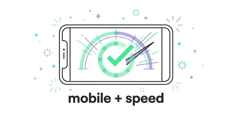
Compress and size imagery appropriately, reserve space for late-loading elements, audit third-party scripts and test representative devices and network conditions. Also test the transactional path: a fast hero does not compensate for a slow form submission, broken payment step or delayed calendar widget.
Responsive design may require different layout decisions, not just smaller dimensions. Keep actions discoverable, use suitable input types, support keyboard operation and provide adequately sized targets. Prioritise devices using observed traffic and revenue, while maintaining a functional experience for everyone.
Forms: convert on perceived effort
Form design is where many pages quietly lose the conversion they earned. The instinct is to ask for everything the sales team wants; the effect is to raise the perceived effort past the point the visitor will pay.
- Ask only for what you need at this step. A quote request rarely needs a company size dropdown; a newsletter never needs a phone number. Every field is a reason to abandon.
- Match the ask to the commitment. A high-intent "book a demo" tolerates more fields than a cold "download the guide."
- Choose one or multiple steps from the task. Multi-step forms can help with branching or complex applications, but they also hide scope and create extra transitions. Test the appropriate pattern.
- Use a specific, accurate button label. Describe the action or next step without inventing urgency or implying an immediate result the form cannot deliver.
- Make errors identifiable and recoverable. Preserve valid entries, explain the issue in text and move focus appropriately for assistive technology.
Every control needs a programmatically associated label; placeholder text alone is not a reliable substitute. Provide instructions for unusual formats, disclose how personal data will be used and ensure the complete form works with a keyboard. These are basic usability and accessibility requirements, not optional conversion tactics.
The form itself is worth optimising as its own surface once the page around it is right — but no form design rescues a page whose offer or message match is broken.
Proof: put it next to the claim
Evidence is useful when it is relevant, attributable and presented with enough context to evaluate. A customer count needs a date and definition; a performance result needs its period, scope and material conditions; a testimonial requires permission and should not imply a typical result when it is exceptional. Unexplained logos or star graphics can create appearance without substantiation.
Place evidence near the claim when that improves comprehension, and provide a path to the underlying source or case details where appropriate. Guarantees, cancellation language and “no card required” statements must match the actual terms. Proof should help the user make an informed choice, not merely decorate the page.
Glossary
- Landing page — a standalone page built for one audience and one action, usually the destination of a paid ad, email or campaign link.
- Message match — the continuity between the ad or link a visitor clicked and the page they arrive on, especially the headline.
- Above the fold — the part of the page visible without scrolling; where the promise, proof and CTA should establish relevance.
- Hero — the top section: headline, subhead, primary CTA and main visual.
- Conversion rate — the share of visitors who complete the page's single goal.
- Core Web Vitals — Google's measurable page-experience metrics: LCP (loading), INP (responsiveness), CLS (visual stability).
- CTA — call to action; the button or link that performs the page's goal.
- Friction — anything that adds doubt, distraction or effort between arrival and conversion.
How the pattern shifts by goal and industry
The skeleton holds, but the emphasis moves with the offer.
| Page type | Design emphasis | Common mistake |
|---|---|---|
| Ecommerce product / offer | Fast hero, clear price and shipping, reviews near the buy button | Hiding price or delivery until checkout |
| Lead generation (services) | Trust, credentials and a low-friction quote form | A long form before any trust is established |
| B2B / SaaS demo or trial | Specific outcome, proof from comparable companies, short form | Feature lists instead of the buyer's outcome |
| Local service | Phone-first CTA, service area, reviews, availability | A generic page that ignores "near me" intent |
| Webinar / lead magnet | One clear value promise, minimal fields, what happens next | Asking for phone numbers on a free download |
The investment should scale with expected decision value, not spend alone. Higher traffic can make controlled experiments feasible, while low-volume, high-value B2B may justify research and qualitative testing even when statistical A/B tests would take too long.
How Space Ads approaches landing page design
We treat the landing page as part of the acquisition system, not a design hand-off. The first diagnosis covers traffic intent, offer clarity, measurement, device performance and downstream customer quality. That prevents a page redesign from being prescribed when the real problem is targeting, pricing, lead handling or tracking.
The ad promise informs the opening, while customer research and sales objections inform the rest of the page. We define the primary outcome and guardrails—such as qualified-lead rate, order margin or cancellation—before testing. Depending on traffic, the right method may be a controlled experiment, usability sessions or a staged release with cautious interpretation. That measurement discipline lives in web analytics that ties spend to outcomes, and the page work sits inside conversion rate optimization, landing pages and performance marketing.
A practical build-and-improve sequence
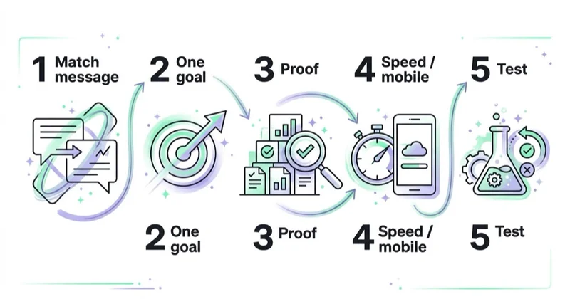
- Define the one goal and one audience before opening a design tool. If you can't name them in a sentence, the page will hedge.
- Write the hero from the ad. Start with message match: what did the visitor click, and how does the headline confirm it?
- Build the information hierarchy from customer questions: offer, evidence, process, terms, objections and next step.
- Design an accessible form. Request only necessary data, use persistent labels and make errors recoverable.
- Test representative devices. Check loading, layout stability, keyboard use, submission and confirmation—not only the hero.
- Instrument the full outcome. Measure the primary conversion, downstream quality and relevant guardrails before changing the page.
- Prioritise a testable hypothesis. Define the expected effect, sample or decision rule and duration; avoid overlapping changes that make interpretation impossible.
Stop doing / Do instead
| Stop doing | Do instead |
|---|---|
| Reusing generic homepage messaging | Build a focused destination for the campaign's audience and offer |
| Writing a clever brand headline | Match the ad's promise in the first line |
| Offering several CTAs and paths | Give one obvious action, repeated at the point of decision |
| Asking for every field sales wants | Justify every field and protect downstream lead quality |
| Treating performance and accessibility as a final check | Include them in design, implementation and QA |
| Parking testimonials in one block at the bottom | Place proof next to the claim it supports |
| Judging the page on how it looks | Judge it on conversion rate and cost per acquisition |
Common mistakes
Common failures are vague offer language, missing material terms, weak continuity with the ad, inaccessible controls, unverified proof and measurement that stops at a form submission. Another is changing a headline, layout, offer and audience simultaneously, then attributing the result to design. A useful programme makes the page understandable first and the learning process credible second.
FAQ
What makes a landing page high-converting?
There is no universal recipe. Strong pages make the audience, offer, material terms and next step clear; continue the expectation created by the ad; provide verifiable evidence; work well on relevant devices and with assistive technology; and request only necessary information. Their success is measured in qualified, valuable outcomes rather than raw completions alone.
What is the ideal landing page layout?
Start with a clear offer and next step, then order evidence, details, terms and objection handling around what this audience needs to decide. Ecommerce may prioritise price, delivery and returns; enterprise buyers may need security and implementation; regulated services may require eligibility and risk information. Research and test the hierarchy rather than copying a fixed sequence.
How is a landing page different from a homepage?
A homepage generally supports several audiences and tasks. A campaign landing page narrows the promise and gives one outcome visual priority. It may still include navigation or supporting links when users need them for trust, comparison, legal information or accessibility. Focus is the distinction; total isolation is not a requirement.
How many form fields should a landing page have?
Ask only for information needed to complete the process or make the next step useful. There is no ideal count. Removing fields can increase completions but may reduce qualification or create more sales work. Compare completion, qualified-lead rate and sales outcome, and explain why sensitive data is requested.
Does landing page speed affect conversions?
Speed can affect whether users can complete the task, especially on constrained devices or networks. Core Web Vitals measure loading, responsiveness and visual stability, but meeting their thresholds does not guarantee conversion. Test real user performance alongside form, checkout and downstream business outcomes.
Should a landing page have navigation?
It depends on the journey. Removing irrelevant global navigation can focus a simple campaign page, but unfamiliar, expensive or complex offers may require routes to pricing, security, company or legal information. Keep mandatory and trust-supporting links, make the primary action clear and test the effect on qualified outcomes.
Key takeaways
- Give one business outcome visual priority while preserving information needed for an informed decision.
- Continue the ad's offer and expectation; exact keyword repetition is unnecessary.
- Build the hierarchy from audience questions rather than a universal section order.
- Treat performance, responsive behaviour and accessibility as design requirements.
- Measure qualified leads, profitable orders and guardrails—not completion rate alone.
- Use research and controlled tests to validate patterns in the context of the actual audience.
Sources and further reading
- Google Search Central — Understanding page experience and Core Web Vitals
- web.dev — Core Web Vitals (LCP, INP, CLS)
- Google Ads Help — Optimise ads and landing pages
- W3C Web Accessibility Initiative — Accessible forms tutorial
Continue learning
Continue reading
PPC Landing Pages: Why Your Ad Clicks Don't Convert (and How to Fix It)
Clicks without business results can point to traffic quality, tracking, the landing page or follow-up. This guide shows how to diagnose the full PPC journey and improve message continuity, mobile use, forms and measurement.
Ecommerce Conversion Rate Benchmarks by Industry (and How to Read Them)
Published ecommerce conversion benchmarks often combine different formulas, stores, countries, devices, and traffic mixes. Learn how to qualify an industry comparison, reconcile Shopify and GA4, and build a decision-ready internal baseline.
Landing Page Mistakes That Kill Conversions (and How to Fix Them)
Landing pages often underperform because the promise, path to action or measurement is unclear. This guide shows how to diagnose message mismatch, mobile friction, forms, proof and tracking without relying on universal CRO rules.