A landing page is a focused destination page built around one primary action: a purchase, lead form, booking, signup, download, demo request or next step in a campaign. A strong landing page connects the user's intent with a clear offer, removes unnecessary distractions, proves trust and makes the next action obvious.
The best landing pages are not just attractive pages. They are decision paths. They align with the ad, search result, email or social post that brought the user there. They explain the offer quickly, answer objections, load fast, work well on mobile and track the right conversion events. For competitive English-language markets, a landing page usually needs sharper copy, stronger proof and better measurement than a generic template.
TL;DR
- A landing page should have one primary goal. Secondary links may exist, but the page should make one action clearly more important than everything else.
- Message match is critical. The headline, offer and page content should match the ad, search query, email or link that sent the visitor there.
- The first screen must explain the offer, audience, value and next step. Clever copy is less useful than clear copy.
- Trust proof matters. Testimonials, case studies, logos, reviews, guarantees, security cues and transparent terms reduce perceived risk.
- Performance affects paid traffic efficiency. Slow pages, layout shifts and heavy scripts can waste media spend and reduce user confidence.
- A landing page needs measurement before traffic scales. Track form starts, submissions, purchases, calls, booked meetings and lead quality where relevant.
- The best landing pages are improved through hypotheses. Use analytics, Hotjar or Clarity, CRM feedback and A/B testing to decide what to change.
What a landing page is
A landing page is the page where a user lands after clicking an ad, search result, email link, social post, QR code or internal campaign link. In performance marketing, the term usually means a campaign-specific page designed for one conversion goal.
That goal can be:
- submitting a lead form;
- booking a consultation;
- buying a product;
- starting a trial;
- downloading a guide;
- registering for a webinar;
- requesting a quote;
- clicking through to a product or checkout page;
- joining a waiting list.
Google Ads defines a landing page as the webpage where people end up after they click an ad. Google also notes that landing page experience is connected with the usefulness and relevance of information, ease of navigation and user expectations from the clicked ad creative. In practice, this means the page must be useful to the person who clicked, not just convenient for the advertiser.
Landing page vs homepage
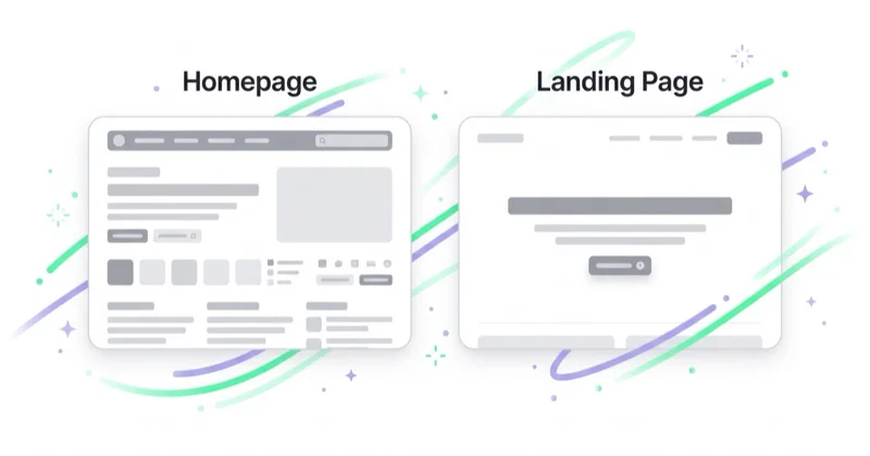
A homepage introduces a company. A landing page drives one decision.
| Element | Homepage | Landing page |
|---|---|---|
| Main purpose | Introduce the brand and multiple paths | Convert one intent into one action |
| Navigation | Broad | Limited or carefully controlled |
| Audience | Mixed | Specific segment, campaign or intent |
| CTA | Several possible CTAs | One primary CTA |
| Copy | Broad positioning | Specific offer and objections |
| Measurement | Many goals | One main conversion and supporting micro-conversions |
A homepage can work as a landing page for branded traffic or broad discovery, but it is usually weak for campaign traffic. Users who click a specific ad should not have to interpret a general company page before finding the promised offer.
Types of landing pages
Different goals require different page structures.
| Type | Goal | Typical use |
|---|---|---|
| Lead generation page | Capture contact details | Consultation, quote, audit, demo |
| Click-through page | Move users to the next buying step | Product launch, ecommerce promotion, SaaS trial |
| Squeeze page | Exchange value for an email | Checklist, guide, webinar, template |
| Sales page | Sell directly on the page | Course, digital product, premium offer |
| Event page | Drive registration | Webinar, workshop, conference |
| Waitlist page | Validate demand | Product launch, beta access |
| Local landing page | Match local intent | Service area, local branch, local offer |
The page type should match user intent. A high-intent search user may need a direct booking form. A cold social user may need more explanation, proof and a softer CTA.
The anatomy of a strong landing page
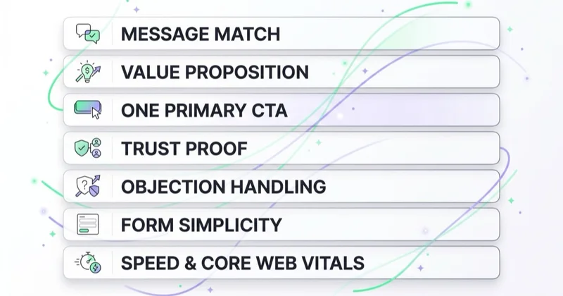
1. Message match
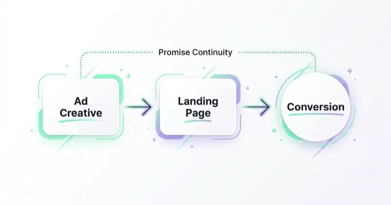
Message match means the page continues the same promise that appeared in the ad, email, search result or social post. If an ad promises a free ecommerce audit, the landing page should not begin with a generic agency introduction. If a search result promises a pricing guide, the page should quickly show pricing guidance or a clear path to it.
Strong message match improves trust because the visitor immediately feels they are in the right place. Weak message match creates friction before the page has a chance to persuade.
Check:
- Does the headline use the same core promise as the ad?
- Does the page address the same audience?
- Does the CTA match the stage of intent?
- Is the offer consistent across ad, page and follow-up?
- Are price, eligibility, deadline and conditions transparent?
For paid campaigns, message match should be reviewed by campaign, ad group, keyword theme and creative angle. One generic page rarely fits every ad.
2. Clear value proposition
The first screen should answer four questions:
- What is being offered?
- Who is it for?
- What outcome does it help achieve?
- What should happen next?
Avoid vague headlines such as "Grow your business today" or "Take your marketing to the next level." They sound polished but say little. A better headline names the outcome, audience or offer.
Examples:
- "Book a Google Ads audit for ecommerce brands spending over $10k per month."
- "Download the B2B landing page checklist for paid search campaigns."
- "Launch a faster product page for your Shopify store in 14 days."
Clarity beats cleverness when a user is deciding whether to stay.
For copywriting structure, see What Is Benefit-Led Copywriting and How to Use It? and How to Write Ad Copy That Converts.
3. One primary CTA
A landing page can repeat the CTA, but it should not create multiple competing goals. If the goal is a demo request, every main CTA should support the demo. If the goal is a purchase, the page should not constantly pull users toward blog posts, unrelated services or social profiles.
A good CTA is specific:
- "Book a strategy call"
- "Get the checklist"
- "Start free trial"
- "Request a quote"
- "See available plans"
- "Reserve a seat"
Generic labels such as "Submit" or "Learn more" are often weaker because they do not explain the result of the click.
For CTA detail, see What Is a CTA and How to Create an Effective Call to Action?.
4. Trust proof
Users rarely convert just because the page asks them to. They need proof that the offer is credible.
Useful proof can include:
- customer testimonials;
- case studies;
- review ratings;
- recognizable client logos;
- screenshots or examples;
- before-and-after context where compliant;
- certifications;
- security badges;
- press mentions;
- transparent company details;
- guarantees or risk reversal;
- clear privacy information near forms.
Proof should be specific. "Trusted by leading brands" is weaker than a named customer, a measurable case study or a concrete testimonial with context.
5. Objection handling
A landing page should answer the questions that could stop the conversion.
Common objections include:
- Is this relevant for my situation?
- How much does it cost?
- What happens after submitting the form?
- How long will it take?
- Is there a contract?
- Can this be cancelled?
- What data is required?
- Is this safe?
- Why choose this company instead of another?
Objections can be handled through FAQs, comparison tables, process sections, proof blocks, transparent pricing, eligibility notes and short explanations near the CTA.
6. Form and checkout simplicity
Forms should ask only for information needed at this stage. A form for a newsletter should not ask for a phone number. A quote form may need more detail, but if it becomes too long, consider splitting it into steps or making optional fields clear.
Check:
- Are required fields truly necessary?
- Are labels visible and understandable?
- Are errors specific?
- Is the privacy statement clear?
- Does the form work on mobile?
- Is there a confirmation state?
- Is the user told what happens next?
For ecommerce click-through pages, the next step should be equally clear. If the page sends users to a product category, product bundle or checkout flow, the transition must feel natural.
7. Speed and Core Web Vitals
Landing pages often receive paid traffic. Every slow load, layout shift or delayed interaction can waste budget.
Core Web Vitals focus on:
- LCP, loading performance;
- INP, responsiveness;
- CLS, visual stability.
The most common landing page performance problems are:
- oversized hero images or videos;
- too many tracking and personalization scripts;
- heavy third-party widgets;
- late-loading fonts;
- layout shifts from banners or forms;
- embedded calendars, maps or chat tools;
- image sliders;
- scripts loaded before essential content.
Performance optimization should protect the conversion path. A page does not need decorative complexity if it slows down the first meaningful content or delays the form.
Landing pages for SEO, AEO and LLM visibility
Not every landing page needs to rank organically. Some are temporary paid campaign assets. But if a landing page is meant to support organic search, AI answers or long-term content visibility, it needs more than a short sales pitch.
Organic landing pages should include:
- a clear definition or answer near the top;
- headings that match user questions;
- concise sections with specific information;
- FAQ;
- source-backed claims;
- internal links;
- schema where appropriate;
- current offer details;
- examples and use cases;
- comparison or decision support.
AEO and LLM SEO reward clarity. A page that clearly explains the topic, answers likely questions and uses structured sections is easier for both users and machine systems to interpret. That does not mean stuffing keywords. It means writing the page so the answer is explicit.
For broader organic strategy, see What Is an SEO Audit and How to Do It Properly?.
Landing pages for Google Ads and paid media
Paid landing pages need strong relevance. The page should reflect the ad promise, keyword intent, audience stage and conversion goal.
Google Ads policies also require destinations to be functional, useful and easy to navigate. Broken pages, misleading experiences, aggressive pop-ups, forced downloads or destinations that do not work for Google AdsBot can create approval and performance problems.
Paid landing page checklist:
- final URL works globally and returns a valid page;
- the page matches the ad message;
- the offer is transparent;
- navigation does not distract from the goal;
- the form or purchase path works on mobile;
- tracking parameters are preserved;
- conversion tracking fires correctly;
- privacy and consent behavior is correct;
- the thank-you page or confirmation event is measurable.
For campaign tracking, see What Are UTM Parameters and How to Create UTM URLs for Google Analytics?.
Landing pages in ecommerce
In ecommerce, a landing page is useful when a normal category or product page is not enough.
Good ecommerce landing page use cases include:
- seasonal campaigns;
- new collection launches;
- product bundles;
- gift guides;
- influencer campaigns;
- remarketing offers;
- subscription offers;
- category education;
- sale events;
- audience-specific promotions.
However, creating a separate page is not always the best solution. Sometimes the right move is to improve the category page, product page or product listing instead. A landing page makes sense when the campaign needs a narrower story, a special offer, curated products or a guided path that the standard store template cannot provide.
For ecommerce diagnosis, see How to Audit an Ecommerce Store and How to Increase Online Sales.
Measurement: what to track
A landing page should have one primary conversion and several supporting signals.
Track:
- page views by source and campaign;
- CTA clicks;
- form starts;
- form submissions;
- booking completions;
- purchases;
- checkout starts;
- scroll depth;
- video engagement if relevant;
- errors;
- call clicks;
- lead quality in CRM;
- cost per conversion;
- revenue or pipeline value.
Lead generation pages should not be judged only by form submissions. A campaign can generate many low-quality leads. The measurement plan should connect page conversions with CRM status, booked calls, qualified opportunities, revenue or at least sales feedback.
For conversion definitions, see What Is a Conversion? Micro-Conversions and Macro-Conversions.
How to test a landing page
Testing should begin with a hypothesis, not random variation.
Weak test idea:
- "Let's test a new design."
Stronger test idea:
- "Users from paid search may not understand the offer quickly enough. Test a headline that names the exact service and audience."
Useful hypotheses can target:
- headline clarity;
- offer framing;
- CTA wording;
- proof placement;
- form length;
- pricing visibility;
- hero image;
- FAQ content;
- comparison table;
- mobile layout;
- page speed;
- trust indicators.
Before running A/B tests, check whether the page has enough traffic and conversions for a meaningful result. If traffic is low, use qualitative research, user interviews, session recordings and heuristic review instead of forcing statistically weak tests.
For behavior analysis, see Why Use Hotjar on Your Website?.
30-day landing page improvement plan
Days 1-3: define the goal
Choose one page and one primary conversion. Confirm the traffic source, audience, offer, CTA and business outcome.
Days 4-7: audit message match
Compare ads, keywords, emails, social posts and page content. Rewrite the headline and first screen if the promise is not immediately consistent.
Days 8-10: review proof and objections
Add or improve testimonials, case studies, privacy notes, FAQs, process steps, guarantees, examples or pricing clarity.
Days 11-14: simplify conversion path
Reduce unnecessary fields, improve labels, clarify CTA copy, test the form on mobile and fix validation errors.
Days 15-18: improve speed
Compress and resize hero assets, delay non-essential scripts, reduce layout shifts and check LCP, INP and CLS.
Days 19-22: validate tracking
Check GA4 events, ad platform conversions, CRM mapping, UTMs, consent behavior and thank-you page logic.
Days 23-26: collect qualitative evidence
Review session recordings, heatmaps, survey answers, sales objections and customer support questions.
Days 27-30: ship one test or improvement
Implement the highest-priority change and measure the result. Record the hypothesis, change, metric and outcome so learning is retained.
Landing page checklist
Before sending serious traffic, check:
- one primary goal is clear;
- headline matches the traffic source;
- first screen explains the offer;
- CTA is specific and visible;
- trust proof appears before major friction;
- form fields are necessary and understandable;
- mobile layout is usable;
- page loads quickly;
- Core Web Vitals are monitored;
- tracking and UTMs work;
- privacy and consent behavior is correct;
- thank-you page or success event is measurable;
- follow-up process is defined;
- sales or support teams know what the page promises.
How we approach this at Space Ads
For paid traffic a landing page is half the campaign, not an add-on. That's why we rarely point ads at the homepage — it answers everyone at once and closes no one. We build dedicated pages for a specific campaign and offer, and the iron rule is message match: what the ad promises has to appear immediately on the page. If someone clicks "hiking boots -30%" and lands on a generic category page, they bounce — and we've paid for a click that leads nowhere. We keep one goal per page, fast loading, and proof close to the button, because doubt is settled in seconds. We treat the page as part of the ad system: there's no point fine-tuning bids to the penny if the traffic lands somewhere the doubts aren't resolved.
Common mistakes
| Mistake | Why it hurts | Better approach |
|---|---|---|
| Too many goals | Users are pulled in different directions | Choose one primary action |
| Weak message match | Visitors feel they landed in the wrong place | Mirror the ad or intent in the headline |
| Generic headline | Users do not understand the offer | Name the audience, outcome or offer |
| Long form too early | Users abandon before trust is built | Ask only what is needed now |
| Proof placed too late | Doubt appears before trust | Place relevant proof near decisions |
| Heavy scripts | Paid traffic waits or leaves | Load only what supports conversion |
| No CRM quality check | Bad leads look successful | Connect forms with lead quality |
| No post-click process | Leads are wasted after submission | Define response time and ownership |
FAQ
What is the main purpose of a landing page?
The main purpose is to guide a specific visitor toward one primary action, such as submitting a form, booking a call, buying, signing up or downloading a resource.
How is a landing page different from a website page?
A normal website page often supports many paths. A landing page is focused on one intent, one offer and one primary conversion goal.
Should a landing page have navigation?
It depends on the goal. For paid lead generation or direct response campaigns, limited navigation often reduces distraction. For SEO pages or complex offers, some navigation and internal links may be useful, as long as the primary CTA remains clear.
How long should a landing page be?
As long as needed to help the user decide. A simple newsletter signup may need a short page. A high-value B2B service, course or expensive product may need more proof, FAQs, comparisons and objection handling.
What should be above the fold?
The first screen should make the offer clear, name the relevant audience or outcome, show a credible reason to continue and provide a visible next action.
What should be tested first?
Start with the largest likely blockers: headline clarity, message match, CTA, form length, trust proof, page speed and mobile usability.
Does a landing page need SEO?
Only if it is intended to receive organic traffic. Paid-only campaign pages can be more focused and shorter, but organic landing pages need stronger structure, useful content, internal links and clear answers.
Is a high conversion rate always good?
No. A high conversion rate can still produce low-quality leads or low-margin orders. Measure quality, revenue, pipeline, retention or profit where possible.
Conclusion
A strong landing page is a focused conversion system. It starts with a clear promise, matches the user's intent, proves trust, removes friction and makes the next step obvious. Design matters, but the real work is alignment: ad to page, page to offer, offer to audience, CTA to next step and conversion to business value.
The best landing pages keep improving. They use analytics to find problems, behavior tools to understand friction, customer feedback to identify objections and testing to make better decisions. A landing page is not finished when it looks good. It is finished when it helps the right users take the right action profitably.
Sources and further reading
- Google Ads Help - Landing page definition
- Google Ads Policies - Destination experience
- Google web.dev - Web Vitals
- Google PageSpeed Insights
- Unbounce - Message Match
- Unbounce - Landing Page Best Practices
Continue learning
Continue reading
PPC Landing Pages: Why Your Ad Clicks Don't Convert (and How to Fix It)
Clicks without business results can point to traffic quality, tracking, the landing page or follow-up. This guide shows how to diagnose the full PPC journey and improve message continuity, mobile use, forms and measurement.
Landing Page Mistakes That Kill Conversions (and How to Fix Them)
Landing pages often underperform because the promise, path to action or measurement is unclear. This guide shows how to diagnose message mismatch, mobile friction, forms, proof and tracking without relying on universal CRO rules.
High-Converting Landing Page Design: The Patterns That Actually Work
A strong landing page makes the offer, evidence and next step easy to understand for a specific audience. Learn how to design, measure and test message match, forms, proof, accessibility and performance.