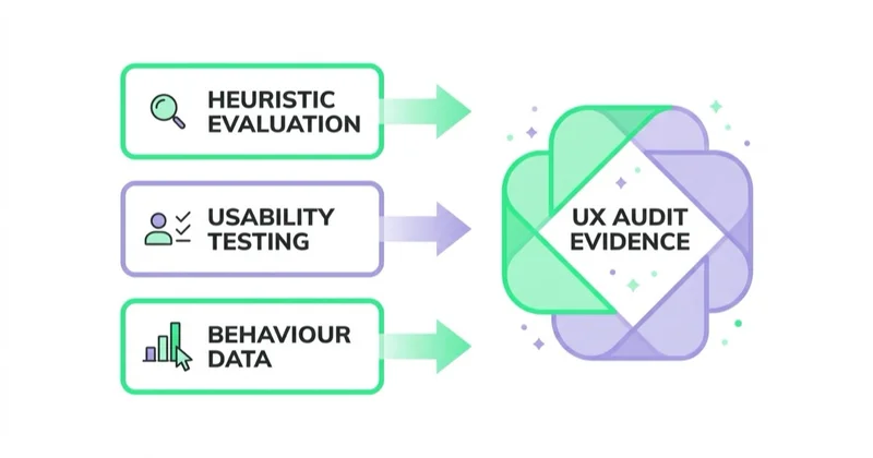
A UX audit is a structured review of how people use a site, store or product. Its purpose is to identify the friction that prevents people from completing an important task and to translate that evidence into decisions a team can implement. Three evidence layers are especially useful: expert evaluation against established usability principles, usability testing with representative participants, and behaviour data from analytics or research tools. Depending on the product and the decision, the scope may also include accessibility conformance, customer-support data, surveys, content review or performance diagnostics. The output should be a prioritised backlog, not a subjective critique of the design.
TL;DR
- Use complementary evidence, not one favourite method. Heuristic evaluation identifies likely interface problems, usability testing reveals where and why participants struggle, and behaviour data shows the scale and distribution of observed behaviour.
- Three to five independent evaluators is useful guidance, not an entry requirement. A single experienced reviewer can still produce value when time is limited; additional reviewers usually improve coverage, with diminishing returns.
- Small iterative rounds suit qualitative usability testing. Five to eight participants per distinct audience is a common starting point, but the right sample depends on the research question, audience diversity and risk. Quantitative benchmarking needs a larger, statistically planned sample.
- Nielsen's ten heuristics are a lens, not a scorecard. A useful finding names the task, context, evidence, consequence and recommended next step.
- Prioritise with impact, exposure, confidence and effort in view. Do not let a neat score override an accessibility requirement, legal obligation or critical failure.
- Fix verified defects; test only uncertain choices. An A/B test on a broken form field spends weeks proving that broken is worse than working.
- Accessibility and usability overlap, but they are not interchangeable. User testing can reveal barriers, while WCAG conformance also requires standards-based technical and human evaluation. Include people with disabilities and relevant assistive technologies where the scope demands it. See accessibility and conversion.
What a UX audit is for
We assume you already know what conversion optimization is; if not, start with what conversion rate optimization is or the complete conversion optimization guide. This article is narrower: the audit itself, method by method, and the discipline of turning observations into a backlog.
The commercial purpose of a UX audit is to find the constraint. Traffic arrives with intent, and somewhere between arrival and outcome that intent leaks away. The audit locates the leak, explains the mechanism and costs the repair. A critique listing everything wrong with an interface is a wish list, and it gets shelved because nobody can say which item pays for itself first. So every method below is judged by one question: does it produce findings a developer can implement and a business can price?
Three methods people keep confusing
Most arguments about UX audits come from treating these as substitutes. They answer different questions, need different resources, and fail in different ways.
| Method | Who takes part | What it answers | What it will not tell you |
|---|---|---|---|
| Heuristic evaluation | One or more trained evaluators, no users | Where the interface may conflict with established usability principles | How representative users will respond, or what the issue costs |
| Usability testing | Participants attempting real tasks | Why people fail, what they expected, where they give up | How often it happens across all traffic |
| Behaviour data | Nobody — analytics, funnels, recordings | Where drop-off happens, on which devices and sources, how often | Why people left, and what they thought was happening |
The last column is why a single method rarely supports every decision. Heuristics may surface plausible problems without showing how representative users respond. A small usability study can explain a failure without estimating its prevalence. Analytics can reveal a drop-off without explaining intent or causality.
A practical sequence for an established product is data, expert review, then targeted user research. Analytics helps identify commercially important paths; the expert pass generates explanations; usability sessions investigate the questions that remain. It is a default, not a rule. A prototype may need interviews and usability testing before it has behaviour data. A product with unreliable tracking may start with measurement repair. An accessibility review should combine standards-based evaluation with testing by people with relevant disabilities rather than wait until the end.
Method 1: heuristic evaluation
A heuristic evaluation is an expert review of an interface against a fixed set of usability principles, with no users involved. Its value is speed and coverage: a few evaluators can walk an entire purchase path in a day and return a list of concrete suspects.
How many evaluators. Nielsen's classic guidance recommends several evaluators because different reviewers find different issues; three to five is a practical range for broader coverage. It is not a minimum below which the method stops working. If only one qualified evaluator is available, narrow the scope to the highest-value tasks and state the limitation. With multiple reviewers, run independent passes before consolidation so one person's attention does not shape everybody else's findings.
Scope it by task, not by page. Do not audit the product page. Audit a returning customer on a phone buying one known item with a discount code. Task framing surfaces the sequence problems — a code field that appears after the total is calculated, a delivery cost that resolves at step three — which a page-by-page sweep never sees.
What it catches: inconsistent labels, unclear system state, missing feedback after an action, error messages that describe a database rather than a fix, hidden costs, navigation built on internal vocabulary.
What it misses: motivation, price sensitivity, trust, and anything specific to a domain the evaluators do not know. Nielsen Norman Group is explicit that heuristic evaluation cannot replace user research, because user experience is highly contextual.
The ten usability heuristics, and how to use them
These are Jakob Nielsen's ten usability heuristics. Nielsen developed the original set with Rolf Molich in 1990 and refined the ten-item version in 1994; Nielsen Norman Group published updated explanations and examples in 2020. The principles remain deliberately broad, so teams must interpret them in the context of the product, audience and task.
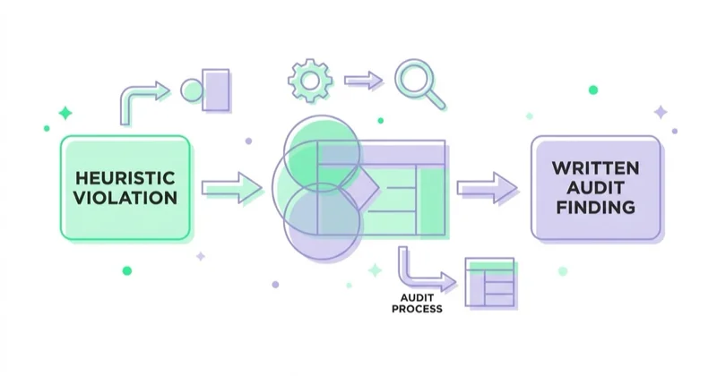
The mistake is treating them as a scorecard. "Violates consistency and standards" tells a developer nothing. The third column is what belongs in an audit.
| Heuristic | What a violation looks like | The finding you write |
|---|---|---|
| 1. Visibility of system status | Nothing visible happens after a click, so people click again | Add a pending state to the submit button; block double submission |
| 2. Match between the system and the real world | Internal names for shipping tiers and categories | Rename options to the words used in support tickets and site search |
| 3. User control and freedom | No way to edit a cart line or step back in checkout | Make each completed step editable in place, without restarting |
| 4. Consistency and standards | Primary action sits left on one step, right on the next | Fix one action layout across the flow |
| 5. Error prevention | Free-text date and postcode fields that accept anything | Constrain the input, validate on blur, preserve what was typed |
| 6. Recognition rather than recall | Delivery cost shown once, three steps before the decision | Repeat total cost including delivery next to the confirm action |
| 7. Flexibility and efficiency of use | Returning customers retype the same address | Offer saved details to logged-in users without blocking guests |
| 8. Aesthetic and minimalist design | Three competing calls to action above the fold | Keep one primary action; demote the rest to secondary links |
| 9. Help users recognize, diagnose and recover from errors | Error reads invalid input, with no field named | Name the field, what is wrong, and what a valid value looks like |
| 10. Help and documentation | Delivery and returns terms buried in the footer | Put the answer at the point of doubt, not on a separate page |
Two rules make this work: every row needs evidence attached — a screenshot, a device, a step — and the finding must be implementable by someone who was not in the room. "Improve error handling" fails both tests. "On the payment step, on iOS Safari, an expired card returns a generic failure with no retry path" passes both.
Glossary
- Heuristic evaluation — an expert review of an interface against a fixed set of usability principles, run without users.
- Usability testing — a study in which participants attempt defined tasks while a researcher observes what they do and where they fail.
- Moderated session — a usability test with a researcher present, able to ask follow-up questions and adapt the tasks; an unmoderated one is recorded without a researcher, cheaper per participant but with no chance to probe.
- Severity rating — an assessment of how frequently a problem is likely to occur, how much it disrupts the task and whether users can recover. In an expert review, these are informed estimates to validate against other evidence.
- Funnel exploration — an analytics report showing how many sessions complete each defined step of a path, and where they drop out.
Method 2: usability testing with real people
Usability testing means giving someone a realistic task and watching them try — not asking what they think of the design. Those produce different answers, and only one predicts behaviour.
How many people. There is no universal number. For formative, qualitative testing, small iterative rounds are usually more useful than one large round: a common starting point is five to eight participants for each materially different audience, followed by another round after changes. Stop or extend when findings reach useful saturation, not because a slogan says the study is complete. Add participants when the product serves distinct roles, countries, devices or accessibility needs. Quantitative benchmarking — for example, estimating task-completion rate or time on task — needs a larger sample calculated for the precision and confidence required.
What a session needs. A task written as an outcome, not as instructions — buy running shoes for a marathon in six weeks, in your size, delivered before the weekend. The participant's own device where possible. No leading questions. Silence while they struggle: the urge to help is the biggest destroyer of usability sessions.
What it catches: wrong mental models, unreadable labels, moments where someone genuinely does not know what happens next, misplaced trust concerns, and the sentence that made a person leave. It also catches what your team can no longer see because they built the thing.
What it misses: population-level scale. A small qualitative study cannot estimate reliably whether a problem affects a fifth of users or a fraction of a percent, and a sample drawn from one audience cannot represent every segment. Pair it with analytics or a properly designed quantitative study when prevalence matters.
Moderated or unmoderated. Moderated is better when you do not yet know the problem, because you can follow the confusion; unmoderated is better when you have a hypothesis and want cheap repetitions. Most audits use both: moderated to find, unmoderated to confirm.
Method 3: behaviour data
Behaviour data is the quantitative layer: funnel reports, step completion, device and source segmentation, session recordings and heatmaps. It answers where and how often, which is what the other two cannot.
Start with the funnel, defined as the real steps of the commercial path rather than the pages of the site. Then segment it. A checkout that looks acceptable in aggregate can be failing entirely on one browser or one payment method, and the average hides it. Device, traffic source, new versus returning, and guest versus logged-in are the four splits that most often expose a problem invisible in the total.
Session recordings and heatmaps are most useful when they investigate a defined question. They show observable interaction, not the user's intent, so avoid turning an unusual recording into a general conclusion. We covered the tooling side in why use Hotjar on your website; the discipline is the same whichever tool you use. First verify that events fire once and at the correct moment. Then configure consent where required, mask sensitive fields, restrict access, set an appropriate retention period and confirm the vendor agreement and local privacy obligations before collecting recordings.
Performance belongs in the evidence set too. Field Core Web Vitals — LCP, INP and CLS — aggregate real-user experience at the page or origin level, while lab tests help reproduce and diagnose an individual issue. Neither replaces task-based research: a passing template can still be confusing, and a slow or shifting interface may need both performance and interaction fixes.
Prioritising the findings
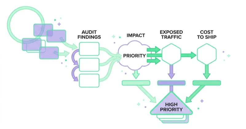
This is where many audits lose value: an unsequenced backlog tends to be implemented by convenience rather than consequence. Assess every finding using four inputs:
- Expected impact — how much behaviour should change if this is fixed, judged from the evidence. A blocked task in usability sessions is high; a cosmetic inconsistency is low.
- Exposed traffic — the share of sessions that meet the problem. Friction on every checkout beats a blocker on a path few people take.
- Confidence — the strength and agreement of the evidence. A reproducible defect supported by analytics and sessions deserves more confidence than one expert's hypothesis.
- Cost to ship — developer days, dependencies, and whether it needs a design, platform or policy decision. Include the political cost: a fix requiring three departments to agree is not cheap.
Use these inputs to create a transparent running order, not a mathematically impressive but fragile score. Accessibility failures, legal obligations, security risks and critical task blockers may need to override commercial reach. Where impact or confidence is unknown, define the cheapest next action that will reduce uncertainty.
| Finding | Expected impact | Exposed traffic | Confidence | Cost to ship | Verdict |
|---|---|---|---|---|---|
| Delivery cost only visible at the final step | High | All checkouts | High | Low | Ship first |
| Generic error on a declined card | High | Sessions hitting a decline | High | Low | Ship first |
| Navigation uses internal vocabulary | Medium | All sessions | Medium | Medium | Schedule; validate terminology |
| Guest checkout not offered | High | New customers | Medium | High | Schedule; needs platform work |
| Full mobile redesign of the product page | Unknown | All mobile sessions | Low | High | Do not start; split into testable parts |
The last row matters most: any finding whose impact you cannot estimate is not ready to be a project. Break it down until each piece has a mechanism you can name.
When to A/B test, and when to just fix it
| Situation | Decision |
|---|---|
| A verified defect — broken validation, failing payment path, unreadable contrast | Fix it. Nothing is learned by testing whether broken performs worse |
| An accessibility failure | Fix it. It is a requirement, not a preference |
| Two credible versions of a message or offer on a high-volume page | A/B test, with sample size and stopping rule set before launch |
| A structural change on a low-traffic B2B page | Do not test. Use usability sessions and a phased release; read outcomes cautiously |
| A tracking discrepancy | Repair measurement first. A test on broken data gives a confident wrong answer |
The instinct to test everything is expensive. Tests consume traffic and calendar time, and one that confirms the obvious has consumed both.
How Space Ads approaches this
We match the audit sequence to the evidence already available. For an established product, that usually starts with validating measurement, because missing or duplicated events can make a healthy path look broken. We then identify commercially important paths and segments, review those tasks against usability principles and use research with representative participants to answer unresolved questions. For a prototype, a new audience or an accessibility-critical flow, user research or standards-based evaluation may appropriately come earlier.
Findings are written with their evidence attached at the moment we see them, so nothing rests on memory when the report is assembled. The deliverable is a running order, not a document: an audit that does not end in a sequence a developer can start on Monday has not finished. That is the shape of our UX audit process — four kinds of evidence in, one prioritised backlog out.
UX audit checklist
Before the interface
- Define the commercial outcome and the steps leading to it
- Verify each step's event fires once, on the right action
- List the segments to check separately: device, browser, source, new versus returning, guest versus logged-in
Quantitative pass
- Build the funnel from real steps, not page URLs
- Read completion per step, then repeat per segment
- Check Core Web Vitals from field data on the templates that matter
- Mark the two or three steps with the largest unexplained loss
Heuristic pass
- Write task scenarios, not a page list
- Choose the number of evaluators to match scope; run independent passes where several reviewers are involved
- Record each observation with screenshot, step and device
- Walk every form field by field: label, validation, error, keyboard, autofill
- Check contrast, focus order, semantics and keyboard operation; define a separate WCAG conformance scope where required
- Consolidate and agree severity in one session
Usability sessions
- Pick the open questions worth paying to answer
- Recruit participants who resemble the traffic, not colleagues
- Set the sample by research question, audience segments, risk and whether the study is qualitative or quantitative
- Include people with relevant disabilities and assistive technologies when evaluating accessibility
- Stay quiet during struggle; record what happened, not what was liked
Output
- Rewrite each observation as a finding: step, evidence, expected change, cost
- Score impact, exposed traffic and cost to ship
- Mark each item fix, test or discard
- Deliver a running order with owners
Common mistakes
| Mistake | Why it hurts | Do instead |
|---|---|---|
| Treating the ten heuristics as a scoring sheet | Produces accusations no developer can act on | Convert each violation into a step, an evidence item and a change |
| Auditing pages instead of tasks | Misses sequence problems, which are the expensive ones | Write task scenarios that cross pages |
| Running one big usability study | Documents problems instead of fixing them | Small rounds, with a redesign between them |
| Evaluators walking the flow together | The second evaluator stops looking independently | Independent passes, then one consolidation session |
| Reading the funnel only in aggregate | Hides device, browser and payment-method failures | Segment before concluding |
| Delivering findings without a running order | Easy items ship, valuable ones do not | Sequence by impact against exposure and cost |
FAQ
How do you do a UX audit?
Define the user task, business outcome and decisions the audit must support. Validate available measurement, review important paths by segment, and run an expert evaluation over realistic tasks. Use research with representative participants to investigate unresolved questions; add accessibility, content or performance work where the scope requires it. Rewrite every observation as a finding with context, evidence, consequence, confidence and next action, then put the backlog in delivery order.
What is a heuristic evaluation?
A heuristic evaluation is an expert review of an interface against established usability principles, carried out without users. Several independent evaluators generally find more issues than one; three to five is useful planning guidance, not a universal requirement. The method identifies likely problems quickly, but it cannot by itself show how representative users respond or quantify commercial impact.
How many users do you need for usability testing?
For formative qualitative testing, five to eight participants per distinct audience is a reasonable starting point, followed by another small round after material changes. Increase or split the sample when audiences, tasks, devices or accessibility needs differ. Quantitative benchmarking requires a larger sample planned around the metric, expected variability and desired confidence. The research question — not a universal rule — determines the number.
What are the ten Nielsen heuristics?
Visibility of system status; match between the system and the real world; user control and freedom; consistency and standards; error prevention; recognition rather than recall; flexibility and efficiency of use; aesthetic and minimalist design; help users recognize, diagnose and recover from errors; and help and documentation. Nielsen refined the ten-item set in 1994, and Nielsen Norman Group later updated the supporting explanations and examples.
Is a heuristic evaluation the same as usability testing?
No. A heuristic evaluation is experts judging an interface against principles, with no users involved; usability testing is real people attempting real tasks while someone observes. The first tells you what is likely wrong, the second why people fail. Nielsen Norman Group states that heuristic evaluation cannot replace user research, because user experience is highly contextual.
Does a UX audit need an A/B test to prove its findings?
No. Verified defects, accessibility failures and clear usability blockers should be fixed directly, because nothing useful is learned by testing whether a broken path performs worse than a working one. Reserve randomised tests for genuine uncertainty — two credible versions of a message, offer or layout — on paths with enough volume to resolve the comparison.
How does a UX audit relate to accessibility?
They overlap in areas such as understandable errors, keyboard operation, focus order and readable content, but they remain distinct disciplines. Accessibility also includes technical conformance, semantics and compatibility with assistive technologies that a general usability study may not cover. Conversely, passing WCAG does not prove that a product is easy or satisfying to use. Combine standards-based evaluation with research involving people with disabilities; user testing alone cannot establish WCAG conformance.
Sources and further reading
- Nielsen Norman Group — 10 Usability Heuristics for User Interface Design (Jakob Nielsen, 1994, updated 2024)
- Nielsen Norman Group — How to Conduct a Heuristic Evaluation (2023)
- Nielsen Norman Group — Why You Only Need to Test with 5 Users (Jakob Nielsen, 2000)
- Nielsen Norman Group — Usability Testing 101 (qualitative study planning)
- Google Analytics Help — Funnel exploration
- web.dev — Core Web Vitals
- W3C Web Accessibility Initiative — What's New in WCAG 2.2
- W3C Web Accessibility Initiative — Accessibility, Usability, and Inclusion
- W3C Web Accessibility Initiative — Involving Users in Evaluating Web Accessibility
Key takeaways
- A strong UX audit combines complementary evidence: expert review identifies likely problems, usability sessions explain observed difficulty and behaviour data estimates scale and distribution.
- Three to five independent evaluators and five to eight qualitative participants per distinct audience are useful planning ranges, not universal requirements.
- The ten usability heuristics are a lens, not a scorecard; a finding is useful only when it names a step, its evidence, the expected change and the cost to ship.
- Prioritise using impact, exposure, confidence and effort, while allowing accessibility, legal and critical-task requirements to override commercial reach.
- Fix verified defects and accessibility failures directly; reserve A/B tests for genuine uncertainty on paths with volume to resolve it.
- Verify measurement first: a mis-firing event makes a working interface look broken.
Continue learning
Continue reading
How Much Does a Landing Page Cost?
A landing page can cost a few hundred dollars or more than $10,000 because the scope may cover only implementation—or research, copy, design, tracking, integrations and optimisation. Compare deliverables, not just quotes.
Website Audit: What to Check Before You Spend More on Ads
More ad spend magnifies both a website's strengths and its leaks. Use this evidence-led audit to find measurement, speed, accessibility, message and conversion constraints before scaling.
WCAG 2.2 and Conversion: Where Accessibility Pays for Itself
Many WCAG 2.2 criteria address the same barriers a sound usability review finds in forms, checkout and login: invisible focus, missing labels, unclear errors and controls that are hard to operate. Learn how to test them, prioritise remediation and understand the EAA context.